Neon Icon: The Art Behind Infamous' Third Lead

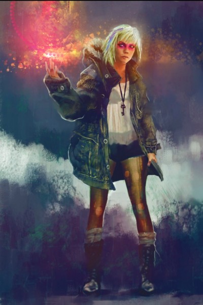
The most interesting character in Infamous: Second Son wasn't Delsin Rowe (the protagonist), or Brooke Augustine (the antagonist), but rather Fetch, a quest giver/power conduit who stole the spotlight with her soulful story and down-to-earth demeanor. She rightfully became the lead in Infamous: First Light, a standalone origin story that fills in plot point gaps, and ultimately tells us what happened to her when she arrived in Seattle.
I talked to Sucker Punch Production's art director, Horia Dociu, about the process of creating a dynamic lead like Fetch. Her look changed and evolved throughout Second Son's development cycle, but several elements remained from the first sketch that Dociu drew of her.
Game Informer: How did Fetch come to be?
Horia: Right in the beginning, when we had discussions about some of the secondary characters that you’d be leeching powers from, we wanted to make sure that we had really interesting characters – not just random people. We wanted them to be special. We wanted them to have a back story just like Delsin does. Fetch is this runaway, homeless girl who tells a little bit of the back story of the InFamous world. She also has the neon power. There’s this Department of Unified Protection and it’s rounding up everybody that’s got superpowers and putting them in this jail called Curdun Cay, whether they did something wrong or not. They’re just like, “Better safe than sorry.” She runs away from home because her parents reported her. She’s this street rat drug addict that fell into drugs as an escape to get away from her parents betraying her. That was a rich image and I think it told a lot of back story about the world. Not just for this character, but the kind of things that happen in the InFamous universe. The idea of a girl that got betrayed by her parents was interesting, and I started sketching her right away in the meeting – sketches of this skinny girl with nylon and a big army jacket, a big warm coat. That idea came all the way to the end product. I think the design process is a bit of a conversation between, “Hey, what do we like? What does the story need? What does the gameplay need? What looks cool?” And so you’re kind of going back and forth and taking huge stabs at all the different variations of the character. Something that stuck all the way through was this idea that she has this rough exterior; she wears this coat almost like armor, yet on the inside she’s got a sheared t-shirt and ripped-up pantyhose. She’s basically this fragile girl that was betrayed by her parents and she’s got nowhere to go, but she puts up this rough exterior. That’s something that’s lasted from literally the first time we started talking about her all the way to what you see in the game. The furthering on those themes, on the jacket, are different from what she started with.

Horia Dociu's early sketches of Fetch
Did you build the remainder of Fetch's look around the jacket?
HD: It’s exploring the idea that she’s a street kid. She’s hiding in clear sight. She has to stay out of the way of the D.U.P. How do you hide in plain sight? That was an interesting question. She’s this sort of loitering teenager. I don’t know if you’re familiar with crust punk, but it’s this fashion style of having lots of patches on your jacket. Everything’s dirty. It’s cool to be grungy and have dreadlocks and all that stuff. Other people are actually homeless and choose a sort of vagabond lifestyle, but others do it to fit in. She’s actually homeless and so we thought, “Hey, let’s give her urban camouflage.” She’s spray painted on her jacket and she’s kind of grimy. She’s got this pink hair, but really it’s to blend in with being one of the people on streets that no one pays attention to. It worked out nicely because giving her that pink hair was deliberate to match her powers, and the skull t-shirt looks like it could be a rock and roll band or a punk band. Even though this is a realistic game, we wanted to harken back to super heroes. We don’t have tights and capes in Infamous and we never will, but the idea that everybody has a persona is really important. If you notice, all the characters have that. Delsin’s mainly dressed in black with a red cap and red shirt for accents. He’s got that star design that represents dual karma. Augustine is grey and yellow, just like her concrete powers. And there’s that bird icon, the DUP emblem. Even, Eugene the video conduit has that Heaven’s Hellfire logo emblazoned down his chest, and he wears blue like the color of his powers. It’s a way to really give them a visual identity and still fit into the very detailed back story.

Color and pencil sketches by Susan Luo
How much did the art influence the overall character? What about Laura Bailey, the actress that plays her?
The story of her being a runaway just felt very natural to the circumstances of the game. The fact that there’s this secret police that hunts down people. We thought, of course there’s going to be this person that’s going to be a runaway. The visuals were just like running downhill. Like I said, from the first sketches she looked pretty similar to what she ended up on. Getting to the final project was more sharpening up the visuals and making sure it’s cohesive and looks cool. I think that story never changed, that she’s a runaway. I think just to put yourself in that situation, where she’s had to survive on the street; naturally she had to be tough. So both for the writer, and also for the artists, it was a no-brainer that we had to make her this gruff character. That’s where, again, that jacket comes in, to give her that tough outer shell like she’s putting up armor to the world, but then she’s fragile inside. She has this secret about Brent, her brother, and the fact that she killed him on accident because of drugs and all that stuff. She’s very much a product of the story and the only way I think it helped really influence the character itself was in what Laura Bailey, our motion capture and performance actress, brought to it. We actually sent her these sketches along with the original script, so she got in her head, “Ok, this is what I look like.” She said that it was helpful to put herself in that mind frame. It’s sort of a tool for her to envision what she looks like because she is such a tough looking character in a way, as opposed to Laura who’s very sweet and dresses nice. It was good for her to have that picture in her head, even as she’s reading the lines for the first time in the audition process. It made her bring out this street roughness that Fetch has that people really latched on to.
Homeless art exploration by Susan Luo
You have five versions here, and they’re all pretty distinct. Are you given direction early on to dream up a bunch of different looks? What is the process like in determining which version sticks?
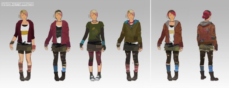
I decide. Based on the stuff that we had in [Second Son], which was again that she’s a runaway teenager and the crust punk fashion style, which if you Google, you’ll see a lot of nappy haired kids with millions of patches sewn on and spikes on their shoulders. Punk rockers times ten. Ornate, like they’re decorating themselves with spoons hanging from their belts and crazy necklaces. Expressing themselves by the way they look. That was very important. You could see this person at the bus stop, or hanging out smoking a cigarette behind the dumpster. We wanted to keep that. None of these have her in like warmup pants; she’s definitely a gutter punk kid. We ended up on the slightly more reddish jacket to double down on the warm colors to match her powers. She still has ripped tights instead of ripped pantyhose and boots with socks. Even though she was hiding to be mistaken for any teenager on the streets, we still wanted her to have a personal presence and style that she enjoys. We thought maybe she wants to do whatever she needs to do to get away. It didn’t take too much exploration to find the dirty look, it was more about how we, in a realistic fashion, bring it back to still feel iconic, like she has an identity, as opposed to just a collection of grungy clothes that any punk rock kid would wear.
In-game headshot renders with paint over by Susan Luo
I want to probe a little bit into the process. When you make these four or five do you show them to the team and get their feedback? How much discussion is involved in these different versions?
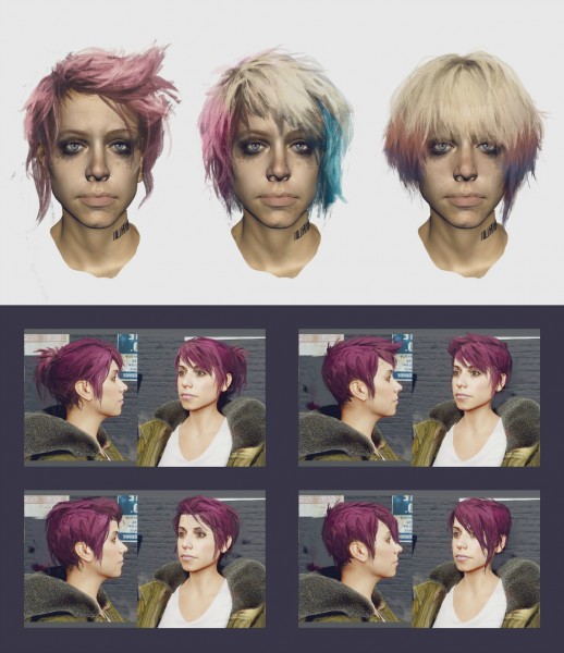
On Second Son, there was a little bit of back and forth. She clicked well because she has such a clear story. But if you look at the images with all the characters, that’s just a portion, there’s probably twice as many or more that both the concept artist would paint over the kind of bald model which was a scan of Laura’s face, we would go through iterations. In my first sketch, she was blonde or whatever, and had kind of this streak of makeup across her eyes. That was one of the first takes. But that maybe felt a little too goofy or too out there, so we did tons of iterations on different hair. She would feel kind of nice, or edgy, or longer hair, but it somehow looked too plain. We didn’t want her to have this gorgeous, amazing, just-got-out-of-a-salon look. If we grunged it up too much, it didn’t look like hair, technically. We had to go through a lot of iterations. And we don’t have design by committee where the whole team gets involved. The character artists (who were making the model), the game director, myself, the concept artist; we all looked at [Fetch] and judged how her model holds up against her story.
Brooke Augustine art by Susan Luo
For Brooke Augustine, the artist teams ended up changing some of her story because of how she looked. Initially, she was meant to be polished, almost like a leader, or general, but at the same time, like Katie Couric, a person who speaks to the media and is the face of the DUPH. She was just lovely. It didn’t work. You can’t be [general and reporter] identically. You have to pick one. And visually she was a bit confused. She had beads, and she had the army coats you see in the final game. We sat down with the writers again, and we said, “Hey, you have decide. Is she more the face of the DUPH, or is she the leader?” It was more important to them that she was the leader and combatant. If you play the game, she had a lot of back story to the leader direction. We changed her more toward having that persona, where she tolerates people, and she puts up with them, and talks down to them a little bit. Art wise, we did exactly what the story was asking for, and it just looked wrong.
It’s funny that you have to see something to understand something that it is fundamentally flawed in some way. That was kind of a surprise, but you know with Fetch, she had such a cool back story, and such an understandable real world plight, that she clicked into place within just a few iterations. Of course, there was, “What design do we put on the back? What color nail polish?” We would paint over that stuff all the time, and have the character team do texture swaps.

Photoshop by Horia Dociu
How much development time was dedicated to iterating on the character designs?
We were touching everything up until the end of production. We’re a small company, less than 100 people, and it’s not like things are done months ahead of time. Everything is coming in hot. Her skin shader was changed even after the first trailer. Her hair was improved. The shininess of the eyes, stuff like that was in flux up until the end. We wanted to make sure that in our trailer, the first time you see her, that she looked solid, and people could attempt to understand who this person is by looking at her. By Gamescom, we had to have her done. In a way, trailers are sort of a forcing function. We know this character is in the game, but because we have a trailer, it forces us to polish her up as opposed to work on everything evenly. We had to finish. “Hey, we’re showing this off, and it can’t look the way it does right now. We know it’s going to look good, but you’ve got to make it look shippable by the end of May. Lets go.” This process kind of answers a bunch of questions that will help make the other characters. So let’s say all of the characters are grey right now, and their faces aren’t animated properly. By pushing one character all the way to completion, first Delsin, then Fetch, and then Reggie, helps unravel some problems we weren’t expecting. It helps us improve the characters. Like I said, we did tweak further into the deadline.
Art by Susan Luo
Even with ordinary clothing, her poses often reflect those of super heroes. Did you subtly hint at certain animations to bring out that super hero aspect?
Absolutely. I’m glad you caught that. I’m glad that came through. Beyond the outfit and the color, drawing the key poses is important in defining the character, and distinguishing them from the rest of the cast. So like Eugene, the TV conduit, he’s a lot more shy, and a lot more reserved. The poses fluctuate between super hero-esque and a normal girl, and then this really, really out-there superhero that can run up walls with laser beams. From a distance, Delsin and her should run differently. Delsin was unpolished, just like a free runner or skateboarder. He’s not trained. You didn’t see any Bruce Lee moves. He’s just climbing, and when he lands, he doesn’t do a cool parkour roll like Cole did. He stumbles and keeps running. With technology being where it’s at, it’s tempting to throw more detail on. It helps make the characters more believable, grounded, but at the same time, it’s important that [Fetch] is still recognizable when she’s simply drawn, like an 8-bit character.
In the old days there were limited color palettes for video game characters. There was this idea that you had to simplify the palette. I think sophistication comes from choosing the right pieces for a character. A good example is Indiana Jones. He has a leather jacket, a hat, and a whip. You can show up to any Halloween party and everybody knows exactly who you are. That’s impressive.
Same with us. If we take away Fetch's pink hair, or her big jacket, she wouldn’t be as Fetchy as she is. Below that there’s the skull patch and the pantyhose.
Horia Dociu Photoshop
After you finish your designs, how often does something drawn on paper not work well in the game?
There’s a ton of that. We slimmed down her jacket quite a bit – it was big and bulky – and it’s still over-sized. It’s rough, it’s dirty, it has graffiti. But we didn’t like the way it moved. We wanted it to feel realistic. Its bulkiness took away some of her showmanship, if you will. She’s excited about using her powers, and she loves getting revenge. She’s always hollering at the DUP while she’s blasting at them. She’s a live-out-loud sort of character. We couldn’t have expressive poses with the big jacket. We had to lighten it up a little bit to make sure that her movements felt right. She could’ve had this big jacket in a movie, but we have to think about how you’re experiencing the character. Sure, you see her up-close in cinematics, but when you’re interacting with her, she’s on rooftops, she’s running alongside you. She’s actually rather small on the screen. The bigger picture silhouettes that the thinner coat allowed us to do were more important to us. You’re hand-making these costumes, but you don’t want them to look too costume-y, but at the same time, you don’t want them to be so random that she seems like a pedestrian.
There's lot of back-and-forth. Where do you put the holes in the pantyhose? How many patches do you need? When does it get noisy? There’s a ton of back-and-forth with the 2D guys, who’ll take a screenshot, send it over, we’ll paint over that, and send it back to them. They’ll put in the details, put it in the game, and say, “The way the specularity works, it’d be really cool to have some shiny stuff. Can you put that in? Can we make her buttons neater?” Just little details with which we want to take advantage of the technology we have. It’s a conversation between 2D, 3D, design, writing, tech, lighting – all of that plays into building the final character and world that you see onscreen. We’re not going to ever be tied down to a certain thing that we drew. The reason to concept is it’s quick and you can iterate fast. If we had to draw her nine times a day, that’s okay, as long as it gets us closer to our target. It’s important to understand the character’s back story. The look needs to communicate visually what the character is. Little bits of the look sent people back to the writing board. It’s a long process and a team effort, but we all believe in the final product being what the user sees – not necessarily what the artists had in mind.
Popular Content


Get the Game Informer Print Edition!
Explore your favorite games in premium print format, delivered to your door.
- 10 issues per year
- Only $4.80 per issue
- Full digital magazine archive access
- Since 1991