Behold The Beauty VII: Your Lucky Number!
You've waited this long, so why wait any longer? Here's another batch of ridiculous video game covers to make your day that much better. Promise.

First off, in case you didn't notice, this game was at no uncertain point in time a "new release." Note the major typographic emphasis on "NEW." Yeah, it really pops. But hey, you need to make things like this stand out on a cover that has no fewer than four separate fields of different copy. Way to prioritize your space. But who can blame them with that awesome cover art of said Guardian Angel (see, he's wearing a shirt that says "ANGEL." Oh those clever designers!) chopping that would-be assailant in the head. That's how you fight crime – violent karate chops to the noggin.
Also, and I could be wrong, but I think Head Trauma Harry is wearing Zubaz or some variant thereof. They match exquisitely with that tan and brown plaid button-up shirt. Holla!
And I have to say, Mr. Guardian Angel himself is sporting a pair of pants that look like a shriveled-up raisin. What are those things made out of, green plastic wrap? Oh well, at least the designers have that dagger with the G.I. Joe snake wrapped around it slicing right through the Guardian's head. That might explain the grimacing look on his face.
I don't think this cover could reek of the 80s anymore if it tried. That Code Masters logo takes the cake. It's bad ass, just like getting stabbed in the head.

An interesting design choice was made when it was decided more prudent to repeat the "EX2" in a garishly large font behind an already large title. I'm not quite sure what purpose it serves other than to cover up a rather creepy looking Ken waving his right arm while standing on one leg. Ken doesn't look non too happy, either. Could be because his arm is freakishly connected to his torso. Or maybe because he's stuck in a sandstorm. I'd be pissed too.
And Capcom? Let's chill with the gradient effect on everything that constitutes a letter. Thanks.
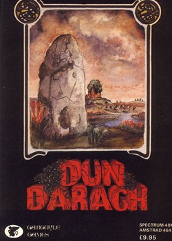
Ooh! It's Dun Darach! Look at that giant rock. Hey, that rhymes. Oh man, this place looks so cool. Look at those spiders (or is it dirt) on the title treatment. Dun Durach must be a scary (or dirty) place. Oh man, is that another giant rock wearing an army helmet in the background? Dun Darach never stops surprising. A land of rocks, spiders, and crackled, old, hand-drawn typography. I'm in.

No

Do you fear long fingernails? Green hands? How about a mysterious red blob with something completely indiscernible inside it? Or how does a random, lone bloodspot that came from who knows where sound? Or better yet, an overreliance of the outer glow effect in Photoshop? Then stay far, far away from Deep Fear. Or should I say "Deep feaR?"

It's obvious this game is of high quality, what with the creepy 3D renderings of the dogs (with pillows for paws) and the insanely large arms on that chair. But the real question one has to ask is how is this the FOURTH installment of this Dalmatians series?! No wonder the Wii was so successful. Yeesh.

I love the old colored pencil cover art of the early 80s. So quaint and lovable, something my five-month-old daughter could whip up in a day's time. But perhaps that was the vibe the designers of Crazy Caveman were going for. How else would you explain the cute blue blow-up T-rex in the lower left corner? Or that pesky little pterodactyl about to peck away at that caveman's shaggy mop of hair? And look at that adorable pile of bones in the lower right corner. Blow-up T-rex sure seems interested. Explains why they're extinct.
And then we have our "crazy caveman" himself. Looks crazy enough. Sporting the prerequisite Fred Flinstone attire along with a gnarly-looking battle club. If he's not careful, he's going to bring the whole Crazy Caveman logo down on himself with all of his bashing and yelling. And then we won't know what the title of the game is! But then again, if I lived in a world with a stupid blue blow-up T-rex to keep me company, I'd probably opt for a crazy logo death as well.
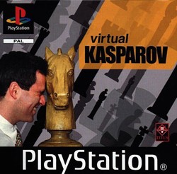
Designers: "Ok Kasparov, here's what we'd like to do for the cover of your highly anticipated PlayStation chess game."
Kasparov: "I'm all ears."
Designers: "It's you, on the cover, wearing a shirt and tie, and, get this, you're headbutting a life-size chess piece. Specifically, a knight!"
Kasparov: "Will it hurt?"
Designers: "Well, no. You see, you're going to just rest your forehead up against this life-size chess piece. And then you'll grimace like you're in severe pain due to said headbutting. But the clever thing is it will also symbolize how hard it is to play chess against you, Garry Kasparov! People will love it."
Kasparov: "Well, ok. But it needs to be done in a tasteful, classy manner. I have an image to uphold."
Designers: "What if we paint the life-size chess piece gold? Classy, eh?"
Kasparov: "I love horses."

Boom! Another cover concept based on chess. How do I know this? Well, the checkered ground is a convincing hint, but it's the large two-tone ball lurking in the background that proves my theory without fail. Or maybe this is a Pokemon battlefield? The ball seems to have the upper hand in this epic showdown as that plastic, shiny two wheel tank has no earthly idea you're lurking back there. It's not surprising seeing that this "tank" has some serious problems…like a set of brake lights on its front end, a yellow hazard light on its roof, and half-orbs for tires (can't imagine those things get any decent traction in the winter time).
But at least the hazard light somewhat matches the color of "Century" in the title. That's what we call unity. And then we have the chromed-out treatment of "Dark" as well as that icon thing – whatever it is (always a good mark of icon design, being unrecognizable). They're shiny too, just like everything else on this cover. So fresh and so clean!
Oh yeah, there's a fox with giant teeth in the lower right corner. Sweet.
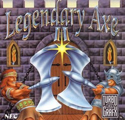
It's a fight to the death between two stubby-armed gladiators (with beautifully adorned belts) wielding massive axes! Also note the realistic-looking flames the designers whipped up in Illustrator in five minutes.
You know what they say about sequels: Go BIG or go home.
You like this stuff? Want more? Well, you're in luck! Check out volumes I, II, III, IV, V, and VI for more Behold The Beauty tomfoolery.


