Behold The Beauty IV: Even Worse Than You Remember
It's been a while since the last stupendous iteration of Behold the Beauty blinded us with its brilliance, so I thought it was about time to blind us all over again. For those not well-versed in Roman numerals, this is the fourth part of what is seemingly a never-ending deluge of artistic junk (parts one, two, and three here, here, and here). That is, video game covers "designed" by supposed "professionals" who prove that beauty is truly in the eye of the beholder. So take a gander at the following ten covers I've lovingly singled out and see how long you can go without wanting to throw up in your mouth.
Get it on…
And look who we have here - it's our good friends over at Phoenix – a staple here at Behold the Beauty. If they don't set the bar for design excellence, then I don't know who does. Take Street Warrior, for example; nothing says tough like two bare-chested, steroid-ridden, lummoxes with hands the size of beach balls looking to take their rage out on the next guy who makes fun of their ridiculously tight pants. The guy on the left is especially frightening, what with his tiny Beetlejuice-like head and monstrous elbows. Last time I checked, the size of your elbows were directly proportional to the amount of weight you could bench press. Or was it the size of your feet? Either way, these two are in luck as they could easily float across the Pacific Ocean with those massive pontoons while simultaneously elbow smashing every shark in sight. Too bad they're stuck in this dump of a city.
Oh yeah, check out that dog. Nice. Every dog I've ever owned – or seen for that matter – looked just as stiff and lifeless as this one. Nothing strikes fear into the hearts of many than a dog with a severe case of rigor mortis – and a massive waxed shine on his nose. Or is that a band-aid?
And if you still haven't entirely bought into the toughness of these two and good ol' Rufus then surely the stylized logo seemingly scribbled out of white chalk will seal the deal. No? Then how about that burning trash can in the background? Or perhaps the "No Parking" sign? I always scream like a little girl when I'm driving around and see one of those. This is a bad part of town. Time to leave before I get elbow smashed.
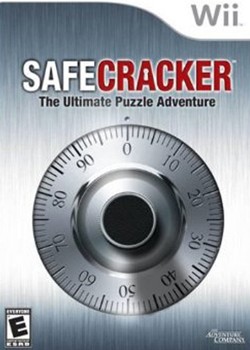
I don't know about you, but when I think of endless fun, I think about opening safes. Lots and lots of safes. Good thing I still own a Wii, otherwise I would have missed out on this gem. But the brilliance of Safecracker runs much deeper than endlessly cracking safes all day long.
While the gameplay premise alone would be above and beyond what most gamers would expect – nay – demand, the designers took it upon themselves to up the ante and create a cover worthy of representing "the ultimate puzzle adventure." Who knew cracking safes could be so fun? I sure as heck didn't. And who am I to argue? Check out the clever keyhole in the negative space of the "A" in "CRACKER." Ingenious. So not only will we be cracking safes with numbered dials, but also ones with keyholes. The variety is mind-numbing.
I'm also loving the Photoshopped noise effect used to create that brush metal background – or should I say safe? Unfortunately, they were so in love with their masterpiece of a background, they forgot to extend the shadow of the dial onto said background. Apparently, the laws of light and shadow do not apply in the world of Safecracker. Must have been a stylistic choice.
And yet when I look at this cover, the only urge I feel is to eat crackers. Nom nom nom.
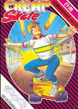
Is there anything better than utilizing a pun for a title? I think not.
But what makes this particular cover so confusing is any and all obvious puns don't really correlate with the visual we're presented. And boy, what a visual it is. Nevermind the 80s-inspired background of retina-burning hot pink diagonal lines and ridiculously cheesy (and completely uncomplimentary) font styles, we've got asteroids crashing down on some poor kid on a skateboard. And yet, I'm baffled as to what the title Cheap Skate actually refers to.
Is this kid a massive penny-pincher? Is the skateboard he's traveling on a piece of crap? Are the asteroids themselves the cheap skates for so obviously startling the poor guy and not giving him a heads up on their impending and destructive arrival? Who or what is the cheap skate here? And more importantly, why use that as your title? Are you trying to bore gamers into a coma? It's like calling your game Sleeping Dog, Rusty Car, or Gassy Pig (ooh, that could be a fun one). If you're going to use a pun, make it relevant to the engaging aspects of your game. But instead, we're left with Cheap Skate. At least a cheap skate wouldn't balk at the price of this blockbuster title.
And since I'm apparently obsessed with scale, I'd like to point out the size of the massive skateboard the kid is riding. That thing looks like a surfboard with off-road radial tires slapped on for good measure. I realize he has to get the heck out of dodge since the whole town is being obliterated by asteroids (and again, the title so perfectly captures that seemingly important aspect), but why on that thing? Is there no one else around to help him escape? Parents? Friends? The mailman? Anyone?
At least he's dressed for the part. Loving that red collared shirt under the white sweater. Nothing like escaping the Apocalypse in style.
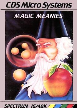
Time for some Magic Meanies! And that can only mean (pun!) one thing – fruit.
So, do you happen to know the best defense for oranges being shot out of a black hole-like vortex at you? A gigantic apple. The kind your elementary school teacher loved to get. Preferably sitting on your left shoulder. It works every time.
That thing is the size of a pumpkin and yet this wizard acts as cool as the other side of the pillow. This must happen to him all the time. What a life. What a horrible, horrible life.
But that apple does look delicious.

Ok, the guy stuck in the headlock is enjoying it a little too much. Seriously. Smile for the camera guys! And the blatant crotch shot? Not needed, ever. Also, could someone please explain to me what that object falling from the sky is and why it's getting lightning shot up its a**? And while we're at it, what happened to the ground?
No. Always no.

Oh great, more fruit.
I'm thinking the creative director on this project really wanted to drive home two aspects: First, that Lady Cruncher has an affinity for flowers. So we must drench the cover design with flowers – of all kinds, but especially the white ones because those are the best. Even Lady Cruncher herself is wearing one on her, uh, head. And secondly, that Lady Cruncher apparently likes to eat and eating makes her very happy. So lets place an apple on the cover. And then some bananas. And then another apple behind the logo. And some more bananas behind a flower (but in water? Gross). And top it off with a fish. Lady Cruncher needs her Omega-3's. I'm actually starting to think Lady Cruncher might even eat the flowers. She looks deranged enough.
And speaking of Lady Cruncher, what exactly is she? A surefire way you know you've failed in the character design department is when your creation strikes confusion and/or fear in those that view it. In Lady Cruncher's case, add repulsion to that list. Seriously, what is she? She's got Reese's Peanut Butter Cup-shaped eyes, an enormous mouth (most likely for the massive amounts of eating she'll be doing), no apparent body (so she's just a head?), purple skin, no hair, huge upper eye lashes, and a head that's shaped like an eraser. What's not to love about this? Oh yeah, she has no nose either, which means she can't actually taste anything. Yet she loves to eat. Character design at its finest.
Sadly, if you squint your eyes enough, this cover could almost pass for a children's cereal box. It even asks, "R U Hungry?" After viewing this cover, how could you not be?
This is a cover from which nightmares are born…and then eaten.
Nothing piques my interest like a game involving a giant futuristic commando waging battle against an endless horde of miniature demon-like creatures.
Oh yeah, there's also this other miniature commando waging the same battle. His weapon of choice? Bubbles. That, or they're all stuck inside a dishwasher. Oh the possibilities.

Yep, you guessed it. Another cover by Phoenix. What tipped you off? The brilliant title? The obviously intriguing story? The compelling gameplay? Or perhaps it's the engaging art? It all comes together in the wondrous package that is Crabby Adventure. The name just rolls off the tongue, doesn't it?
Crabs lead an exhilarating life, so I can only imagine how thrilling it must be to play as one. Just look at what this cover hints at: Treasure (crabs need money), swords (crabs like to fight with swords), sunken ships (crabs love to take trips), cannons (a crab's worst enemy), seahorses (it's who crabs date), other crabs (friends and family, mostly). The list goes on and on.
The best part is the bizarre spotlight that shines down in the center of the cover and highlights seemingly nothing – save for a small crab that looks so washed out that it looks like a ghost crab. Oh no, ghost crab! Looks like ghost crab is making a play for that sword. Even the seahorses are cheering him on. Kill me now.
Also note how much emphasis the word "Crabby" gets in the title. Either the developers were too lazy to give the game a remotely original name – I get it, the game has crabs…wait a minute – or they were trying to tell us something. I vote for the latter. And so should you.

Max Headroom called. He wants his rad background back.
It's always reassuring to know that the Ninja Rabbits game you just picked up does, in fact, contain "Ninja Combat." Anything less would be unacceptable. But when did said ninja combat consist of a psychotic rabbit hurling himself at you with not only a wooden baton, but a freakishly large foot as well? That right foot is bigger than Mr. Mohawk's head. Maybe that's why the rabbit looks so mad – he hates his freak foot. At least Mr. Mohawk had the sense to coordinate outfits with his equally horrified partner-in-crime. If you're going to get your a** handed to you by a lunatic rabbit, might as well do it looking like the Bobbsey Twins.
The headband used to tie the rabbit's ears back is an especially nice touch. Is this so his ears won't get in the way of the severe beatings he'll be doling out? If you're going to play the part of a ninja rabbit, you might as well go all the way. You also gotta love how the logo is made up of letters that look like parts of a karate belt. Clever tie-in guys, very clever.
I'm starting to realize where the creators of Teenage Mutant Ninja Turtles got their inspiration from. Can you blame them?

I am now officially blind.
So it's King Kong…I think. It's hard to tell since this supposed version of Kong looks like he's been binging on Ho-Hos and Twinkies for the last thirty years. A giant blob covered in fur with a giant lump on the top of his head is supposed to be menacing? Look at how fat he is. When has Kong ever looked like this? Can he even move let alone hear anything with those ridiculously tiny ears?
But that's the least of Kong's worries. He's got to contend with that Popeye-looking Pinocchio smashing his chest to oblivion with his trusty mallet. That measly little weapon will surely do the trick – especially since it causes Kong's chest to burst with bananas. Makes total sense. It's comforting to know that Kong, if anything, gets enough potassium in his diet. The real treat is that Kong looks highly amused at Popeye's antics. It's as if he actually enjoys the beating. With so many layers of fat, I highly doubt Kong feels a thing.
And then there's the damsel in distress. She came to this party fully decked out. Umbrella? Check. Purse? Check. Giant blue necklace? Check. Full head of gray hair. Huh? Apparently Popeye is dating my grandma. I can't really blame him, though. It takes a special kind of woman to love a guy with a schnoz like that. Love works in mysterious ways.
And so do the designers who came up with this cover.
Alright, time for a breather. But fear not, there will be more vomit-inducing covers to agonize over the in not-so-distant future. Until then...
Popular Content


Get the Game Informer Print Edition!
Explore your favorite games in premium print format, delivered to your door.
- 10 issues per year
- Only $4.80 per issue
- Full digital magazine archive access
- Since 1991