Behold The Beauty VI: So Bad, It's Good!
I apologize for the rate at which these stupendous displays of box art wizardry are trickling out. I just don't get around to pumping these bad boys out as frequently as I used to. But fear not, as long as I'm breathing (and Game Informer gainfully employs me), I'll do my best to expose the masses to the wonderment that is Behold the Beauty. That, and I need a confidence boost every once in a while. So here we go with round six. Strap yourselves in, you might get nauseous along the way.

Let's pull no punches and dive right in, shall we? It's AAARGH! that settles into the leadoff spot this time around, and what an impression it makes.
I get the whole energy rush one would get from witnessing ‚ and controlling! ‚ an epic battle between a fierce fire-breathing dragon and an intimidating Cyclops with Spock-like ears and a nasty horn jutting out of his head. It's even cooler that these larger-than-life combatants are busting out of their respective arcade cabinets like a jack-in-the-box on steroids as some poor *** ‚ with fashionable rolled up jeans and shiny black shoes ‚ tries to harness their power with his wired joystick. Heck, there's even electricity coursing through and out of each arcade cabinet; this cover just screams ACTION! And what better way to aptly communicate this not-to-be-missed experience than with the brilliant title of AAARGH!
AAARGH! is what I immediately think (and maybe even mutter under my breath) when I read that the title of this game is, in fact, AAARGH! The creative well must have been running critically low when the marketing wizards christened this baby with such a horrendous name. Here's hoping they never made a sequel to this masterstroke. Can you imagine the possibilities? EEEK! UGGHHH! OOOMPH! GAAAHHHHH! Ok, I'd rather not.
I will say, though, that Cyclops does have some nicely combed hair. Gotta reach that female demographic any way you can.
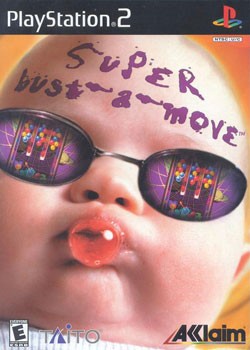
I know, we've all seen this cover before and yes, it's probably been beaten to within one inch of its life for its insane usage of a baby wearing sunglasses that in no way correlates at all the the actual game. But guess what? It's a horrible idea so, therefore, it gets more of a beating!
First off, from a technical standpoint, the Photoshopped sunglasses just look downright bad. Seriously, please at least try. And whose brilliant idea was it to put the title of the game on the baby's forehead? What is that even supposed to mean? Is someone supposedly disfiguring this helpless baby with ink or did the baby, in some amazingly ambidextrous fashion, write the title of the game on its own forehead? Last time I checked, only a mentally unstable person would tattoo a game title onto their forehead, trademark symbol and all.
And here's an even more pertinent question: Why even use a baby at all?! Babies don't play video games, so they sure as heck don't play Super Bust-a-Move. And since they don't play Super Bust-a-Move, you'll never catch one rocking out to said game wearing sunglasses (wait, those aren't real?!), chewing bubble gum (last time I checked, babies don't have much in the way of teeth, let alone the motor skills to properly consume gum without choking and dying), and, oh yeah, acting oh-so cool with that game title splashed across its forehead. Wait, is that even gum the baby is chewing? The baby's blowing a bubble, right? It's always nice when the first emotions your cover elicits is confusion and anger.
Poor baby, poor game. No wonder Akklaim went out of business.
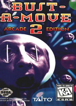
The poor folks over at Sega decided Akklaim's version of cover hell wasn't egregious enough, so they went ahead and decided to go for broke. Seriously, can no one design a "proper" cover for Bust-a-Move? While the aforementioned "Too Cool for School" baby cover was Akklaim's weak attempt at being hip and edgy, Sega has decided to just go right for the jugular and scare the living crap out of everyone who has the unfortunate luck to cross paths with this abomination.
No, I do not want to play a game that will, by the looks of it, force me to prop my eyes open with matchsticks. Seriously, matchsticks? Isn't this just a whimsical, appropriate for all ages puzzle game? So why do I feel like I'm watching a scene from A Clockwork Orange? Eyeballs McGee doesn't look like he's having any sort of fun and actually appears to be in a decent amount of physical pain. Just want I want out of my gaming experience‚ pain and matchsticks to further elevate said pain.
But at least we know there's a lot of balls; all providing even more proof that matchsticks really do an admirable job of ensuring you'll never, EVER, stop playing Bust-a-Move: Arcade Edition. I'm sold.
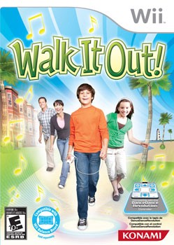
Mmm, walking. It's so much fun! My whole family loves walking, especially when you do it to music. Even my Dad gets in on the action even though he's more into lunging. My Mom is great at walking but sometimes trips over her obnoxiously long jeans. Oh Mom, when will you ever learn? Hee hee! My sister also adores walking almost as much as me. She especially loves it when we take a nice stroll past the fake beach under a beautiful striped sky. That really puts a smile on her face. But when it comes down to it, I like walking the most. I even tend to bring my Wii Remote and Nunchuck along because it makes me so darn happy. So happy that I tend to pee my pants. Don't tell my Mom.
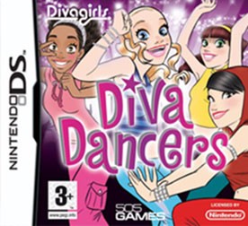
Scary, possessed-looking blonde girl, please go home. The rest of you divas, find a new friend.

A number of interesting choices to note here on John Daly's Prostroke Golf. How about the fact that "Prostroke" isn't even a real word? And if it was, I'm pretty sure I wouldn't associate it with the game of golf. Secondly, who thought it was a grand idea to put Daly's name on the cover twice? Is his "official" autograph sitting above his already apparent sans serif name treatment not enough? We get it, you've got John Daly on your cover, what a coup. This guy hasn't been relevant for over twenty years, but hey, people will really go for that autographed look. Especially when you've got it encased in a golf ball that's shaped like a football. And if that doesn't get the consumer's attention, Daly's insane quilt pattern pants most certainly will. I just went blind. EA, you taking notes?

You know, for being a relatively "newer" system, the Wii has an inordinate amount of games with horrendous cover art. And unfortunately, Hall of Fame wide receiver Jerry Rice has now been dragged under the bus as a result.
If I were Rice, I would have fired my agent the moment this game was pitched to me. Dogs playing football? Earth to morons, dogs have no arms. That's a key component when it comes to, I don't know, having to actually throw the ball. Or is everything a running play? It's obvious these dogs know how to catch, as made apparent by the lab who's jaw is apparently able to open a freakish 90 degrees, while ever so gracefully leaping over that masterful logo. Too bad the defense is about as bad as this cover design. Look at that Chihuahua just standing there. I guess it's pretty hard to notice a giant yellow lab jumping over you when you're posing for the camera. And then there's that giant poodle in the background. Is she standing on a hill? Why are her hind legs so much higher than her front legs? This field needs some work. At least she's got a good view of the action. Holy crap, this game looks like so much fun!
But wait, where's Jerry Rice and Nitus ‚¬†the ones whom this game is named after? Oh, how clever! The designers put them together in an unassuming, boring little circle in the upper lefthand corner of the box art. I'm glad they included their respective names under said circle, because otherwise I might mistake them for some random guy who likes to sit uncomfortably close to his dog while having his picture taken. And check out the way Nitus is eyeing Rice. Jerry is all about the photogenic pose while Nitus is transfixed on Rice's mug. What a great pair.
Move over Turner and Hooch, you've got company.
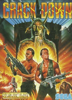
Hey Tango and Cash, the creepy, demonic goat man is right behind you! How could you miss him with a nose that big? Is he/it chewing on a piece of straw? Ahh, one of life's simple pleasures. It's possible this oiled-up, dynamic duo has other, more urgent things to attend to: Like idiot boy on the left standing in a pit of fire. That's never fun. You know what else isn't fun? Being chased simultaneously by an ape (scary!) and a graffiti-laden storm trooper (what?). Talk about in over your head. Also note the clever graphical implementation of cracks in the Crack Down wordmark. Tango and Cash are cracking down so much that they're literally cracking the logo itself. Brilliant.

Nothing sells the game of Pictionary like a phallus-like pencil tickling a pregnant stick woman's belly. Seriously, that pencil is so proud.

Interesting artistic style used for this version of Ghost Recon. I was unaware that chalk-based illustration had come back into the mainstream. It does wonders for emphasizing the dark, gritty, brutal tone that is jungle warfare. Having a bunch of soldiers lounging around doing absolutely nothing does the same thing as well. Well, I guess that guy in the back waving his arms around is doing "something." Ooh, the excitement. I always knew the Tom Clancy Ghost Recon series was lauded for its intense, realistic depiction of war, but who knew so many people liked playing a game where all you do is sit around and wave helicopters in? I need to add this game to my must-play list, pronto.
And there you have it, the sixth edition of Behold the Beauty in the bag. Let me know what you liked, what you didn't like, or just say hi. Also, feel free to check out installments one through five (I, II, III, IV, and V) for even more gut-busting, eye-blinding cover fun. Trust me, it's good for you. We'll be on to lucky number seven before you know it. I promise. 'Til then.
Popular Content


Get the Game Informer Print Edition!
Explore your favorite games in premium print format, delivered to your door.
- 10 issues per year
- Only $4.80 per issue
- Full digital magazine archive access
- Since 1991