Behold The Beauty III: And Boom Goes The Dynamite
And here we go again: To that wonderful place where putrid design and insane marketing strategy come together to form what can only be described as a visual abortion. This third iteration of Behold The Beauty (the first two can be found here and here) features some interesting creative choices – a rabbit, male bonding, and genetic abnormalities, to name a few – and the results are simply stupendous. Or just plain stupid.
So follow along as we uncover ten more diabolically deranged covers in our never-ending quest to find the elusive answer to that one singular question – why?
Growing up as a kid, I had ample experience dealing with misbehaving pets. Thankfully, none of them resembled the likes of Bad Cat; otherwise I would have just settled for a pet rock.
Just look at him. If the Rambo-like headband, hip shades, and spiked wristband doesn't give you any indication of this feline's propensity for mischief then surely his spray-painting skills will. Never mind the fact that this cat not only knows how to wield spray paint and spell (I'm sure all bad cats and dogs and hamsters can do that), but this guy has the gumption to boldly state that he is, in fact, "bad" right there on a brick wall by which he so happens to be hanging out – Michael Jackson style. Oh, and in case you didn't know, he did you the favor of letting you know that he is, indeed, a cat. Don't want any confusion here. Good thing too, because I'm already perplexed as to what he's holding in his left paw. Is that string cheese? A stick of butter? Or perhaps a lighter? Don't tell me this cat smokes as well?! Or maybe he's into pyro. Perhaps the four debauchery thought bubbles he's throwing our way will give us some insight into his shenanigans. (Just as a side note, all great designers use bubbles as an effective and totally appropriate visual tool for delving into the psyche on an individual or, in this case, a cat.)
Yet further investigation reveals that the antics found inside said bubbles do anything but reinforce the notion that this cat is indeed "bad." Falling off a beach ball? Throwing an unidentifiable object into a garbage can? Jumping off a stool? Please. I do these things all the time and never once have I had the urge to proclaim myself a "bad human" on some random brick wall. Look at how scared s***less Bad Cat is while falling off that beach ball. You've got to be kidding me. Bad Cat? More like Lame Idiot.
Oh yeah, that Rainbow Arts logo ain't nothing to write home about either. Another winner.
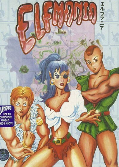
This cover is weirdly creepy if you look at it long enough.
When did Mr. T start sporting a Peter Pan costume? Check out that dude on the left. Look at his eyes. (!!!) Yeah, I made the same mistake. Another interesting observation – when did women's legs become bigger then their midsection? She must do a ton of squats. Strangely, her left breast is twice the size of her right one. Yet her left leg seems smaller then her right leg. Good times. The artist might have wanted to consult a real life model to work out those annoying little proportional quirks. Or maybe that's how your typical elf woman is built. I mean, with her pirate eye patch, giant man hand, and Sasquatch-like legs, she's the most masculine, toughest looking elf of the bunch. Actually, it almost looks like they're posing for a WWE promo shoot. That title isn't too far off either: Elfmania = WrestleMania.
Wait a minute...
Over-the-top costumes, make believe characters, ripped muscles, intimidating poses, a sense of urgency in the air, the feeling you're about to get ripped off. Coincidence? I think not. This has wrestling written all over it. Elf wrestling!
Just don't look at those eyes.

The most paramount creative technique to use when it comes to the selling and marketing of games (or anything for that matter) – I just don't understand why more designers don't utilize such a proven tactic – is without a doubt the insanely large nose render. You slap a freakishly honker of a nose on your product's packaging and I guarantee people will flock to it en masse. Think about it, everyone loves a nose that's the size of baby's head. It's just so attractive and inviting. Even that dog on the cover is obsessed with it; like he's about to hump the guy's face right there on the spot.
You look at this box art and start to wonder what the intended focus of the game really is. The dog? Or the schnoz that has the potential to block out the sun. That guy's teeth could use some work too. Looks like he chewed on a pen a bit too long. Mmm, ink. He needs a lady friend. But it's not like the dog is without faults of its own: Check out that giant torso. Yep, a little too big for such a seemingly small head. Poor pooch. He was also unfortunately saddled with a pair of giant bat wing-like ears. Yeesh. What kind of dog is this?
Yep, "big" seems to be the theme of the day for Scrapyard Dog. Even the title itself was apparently too large and thus curves, ever so elegantly, down to the left – buckling under the weight of the ten ton boulder strapped to that guy's face. Looks great too. Nothing sloppy about it at all. Oh well, at least we've got a wonderful sun burst to help catch our eye. As if that nose wasn't enough of a focal point as it is.
A man and his love for a dog. Let nothing come between them.... other than that nose.

Aww, look how cute those little ballet shoes look all tucked away behind the My Ballet Studio logo. I'm glad they're there, otherwise I'd have a hard time figuring out just what type of studio this is. I also really like the tiara the older ballet dancer is sporting. Nice touch. And that little girl, isn't she just the cutest? Look at her graceful posture, those adorable almond-like eyes, the way she's so elegantly extending her arms...
Wait a minute, where's her right arm?!
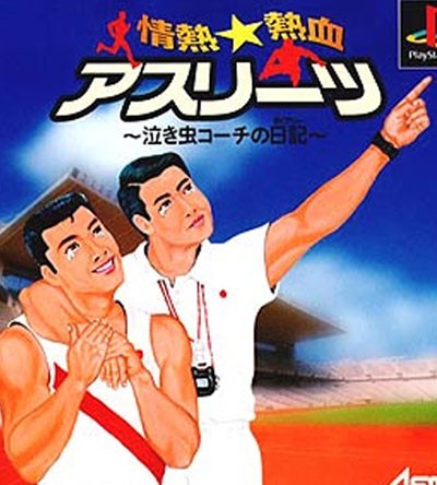
No.
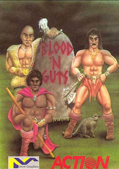
I think my four-year-old niece could have drawn a more compelling cover than this Crayola barf fest. Gotta love the perma-scowl all three tough guys are sporting. GRRR!! The dude on the right is so tough that he doesn't even realize he's clomping on that cat's tail. In fact, looking at the manner in which he's standing, it almost appears as if he's pinning that cat down on purpose. Call PETA. This has trouble written all over it.
I do like stick boy's salmon-colored feather boots and blazing magenta-esque cape. Very manly. I wouldn't go near that guy. But can someone, for the love of God, tell me what Mr. Baldy is holding in his left hand? What is that? A melting ice cream cone? I'm confused. Who eats ice cream next to a stone covered in hand-written blood surrounded by two bare-chested men in the middle of the night? He's even spilled some of it onto the stone. It could be those shoulder pads he's wearing; probably makes it hard for him to maneuver that cone without getting ice cream everywhere. I once tried to eat an ice cream cone with all of my hockey gear on – it wasn't pretty.
And neither is this bumbling threesome and the crayon frenzy they rode in on.

Quick, what's the first fighting game that comes to mind when you think of the 16-bit era? Street Fighter II? Killer Instinct? Mortal Kombat? Or maybe even Primal Rage? All logical choices.
You know what isn't logical? A title by the name of Power Instinct. I never knew the game existed... until now. Poor me.
And now poor you as well.
Let's see what we have here. Ah yes, first that lovely treatment of the title "Power Instinct." Classic serif font with an insanely over-stylized chrome reflection. Bling bling. Not really all that egregious in the grand scheme of things. That is, until you boot up the game, get to the title screen, and see this...
Huh? Say hello to random font fun time! Is this even the same game? You see, the fine folks who designed the cover for this undoubtedly splendid fighting game (an old woman who shoots her dentures at you is just one superlative example) apparently never once bothered to even check out the title screen to see what look had already been established. Nope, they instead decided to take the title treatment in another direction entirely. That's good continuity right there. We go from bling bling to Saturday morning cartoon freakout in the blink of an eye – and no one viewed this as a problem. Awesome.
Unfortunately, we're not done yet.
Check out the guy on the right. That dude is ripped – almost a little too much for my liking. Case in point: Look at those boob-like pecs the illustrator decided to give our knee-eating friend. No man, in the history of all the strongest men, has ever had pectoral muscles that large and, more disturbingly, round. It looks ridiculous. Also note the profuse sweat rolling off this guy's body. Must be nervous. That, or he just got done doping to get ready for this epic showdown. Seriously, his veins need their own area code. And you gotta love that orange burst that seems to envelope this poor ***. It could signify the relentless beatdown he's enduring. Or it could be his 'roid rage acting building up.
And then there's chrome dome on the left – not as much sweat here even though he's the one doling out the punishment. And while that flying knee lift looks incredibly fierce, I'd be more worried about his giant elephant/grandpa foot getting anywhere near my head. Look at the size of that big toe. No thanks. It's liable to poke out an eye or, even worse, choke you to death. 'Roid Rage better close his mouth because there's a special toe jam delivery heading his way.
Last but not least, we have chrome dome's head itself. Notice the massive wart (or maybe a welt?) above his right eye. Attractive. People can't get enough of the warts. But even more disturbing are the holes located just to the left of said wart. Holes? And they're all in nice little rows too. Unless that's meant to be some weird Mike Tyson-esque tattoo, I have no clue as to why a guy would be sporting holes in his noggin. Name one famous fighter that ever had rows of holes in his head. Perhaps this guy is the first... and most likely last. If anything, it might explain why he's so angry – you'd be too if your head was full of holes and warts, right?
At least his weird orb belt matches the blingy title. There's your continuity right there. Bam!

This cover just makes me want to throw up in my mouth.
First, take note of the different lighting angles we've got going on here. From behind the bird, from the upper right of the horse, from the left of the rabbit, straight on with that creepy little dog. I never knew the sun had the ability to direct its rays at multiple angles all at the same time. This is quite a revelation. Too bad we live on planet Earth where we only have one sun – not multiple suns like they apparently do on planet Bizzaro.
And then we have the lovely vet herself. I could do without the purple getup, but whatever – go Vikings! What's more striking is the way in which her left arm seems to defy all logic. She's either sporting a gimp arm that's half the size of a regular arm or that cat, being much more rotund than we realize, has crushed said arm under its massive weight. She's keeping her cool though.
Like that Photoshopped bandana around the dog's neck? Yeah, me too. It's apparently resistant to casting any type of a shadow – even when there's multiple suns involved. Same goes for the vet's right arm too. And yet the dog's ears are totally shadow capable. (Sigh...)
Don't you just love the way the designers stuffed that feline into the lap of the vet? Physics be damned! The cat's legs look like floppy rag doll arms. No wonder the cat looks pissed. And please remove that stupid pink bow from atop that little runt dog. It's just insulting to everyone involved. As is the way they "attempted" to blend the dog's fur with the vet's purple garb. Once again, very believable.
But let's get real (pun intended, thank you very much): Look at the size of that fricken rabbit! They can't be serious. Who in their right mind thought it was a great idea to place Godzilla rabbit amongst all the other relatively normal sized creatures? Even partially tucking it behind the ESRB rating can't hide the fact that this bunny hasn't missed a meal in eons. Do these people think rabbits are normally this large? It's a rabbit. And look, the brain wizards behind the Wii cover loved monster bunny so much they decided to use it on the just-as-stellar DS cover as well – just not as grossly bulbous:
The same exact rabbit. The same exact pose. The same exact "I'm going to murder you" look in his eyes. But all with new friends to terrorize. Sweet.
Oh yeah, I also couldn't help but notice how this particular vet's left hand just seems to disturbingly disappear into the bale of hay. Or maybe she has no left hand at all. Perfectly normal, perfectly healthy. What is wrong with these people?!
I guess living on planet Bizzaro will do that to you.

Who hasn't seen this cover by now? Yeah, pretty much everyone. But that doesn't mean it's any less craptastic. And man oh man, this cover puts the "c" in craptastic.
First of all, did anyone at Capcom ever actually check to see how this cover was coming along? EVER? And even if they didn't (which always makes good business sense), how on earth could you sign off on something that so little resembles not only Mega Man himself, but the game itself as well. It's insane to think this design ever saw the light of day.
The fact that Mega Man's great grandpa apparently stood in for the model rendering is alarming enough. Not to mention the super baggy sleeves he's sporting. They obviously had a problem in wardrobe. Apparently no one told the artist that Mega Man isn't some geriatric with a panache for awkward poses and firearm incompetence. But come to think of it, Mega Man doesn't even use a pistol. But hey, let's give him one anyways. And let's have him hold it in some cockamamie manner that makes him look like an inept idiot. And while we're at it, let's just stylize the whole cover after that one famous movie of the early 80's, Tron, and forego any type of individuality on our part. Mega Man and Tron are practically one in the same anyways: The main characters both have arms and legs and wear a helmet. The similarities are endless – obviously. But at least in Tron they didn't have a case of the baggy arms.
I also don't think Tron had glowing palm trees. And come to think of it, Mega Man doesn't either – and yet there they are, in all their glory. And what, may I ask, are those yellow circular things scattered all over the ground? They're so dumbfounding that I can't even come up with a clever quip to make fun of them with. Seriously, what are they? (Again, the sign of a great cover design)
And that's the problem with this cover. It's confusing and ridiculous on so many levels that it's almost insulting. Not only to Mega Man himself, but to fans and competent designers as well. Heck, it's insulting to anyone with a pair of eyes and a creative competency of a four-year-old.
But apparently Capcom loved it. In fact, they loved it so much they decided to put their name on the design twice (always a classy move). Fools. If I were them. I would have marketed this cover as the culmination of a preschool coloring contest. But then I'd feel bad for preschoolers. Meh.
Oh well, at least we know by looking at this magnificent design that the game is "state-of-the-art." Yes, this wonderful cover actually proclaims this.
A bigger oxymoron in the history of oxymorons I cannot fathom.
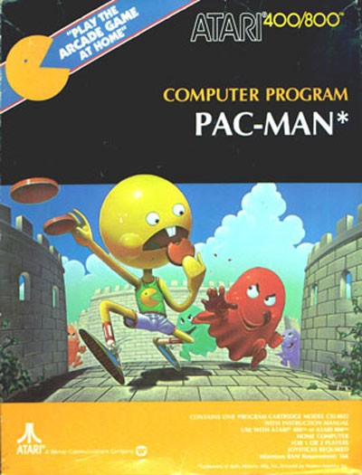
And you thought you knew everything about Pac-Man. Ha!
I bet you didn't realize that good 'ol Pac-Man has an actual body, which consists of two spindly arms and two equally spindly legs. Did you also know that Pac-Man wears a size 22 torpedo-shaped shoe that helps him evade hordes of ghosts in what looks to be a castle courtyard? I always though he floated around on just his head in some nondescript maze? Silly me. Were you also made privy to the fact that Pac-Man likes to wear a shirt depicting himself – yet in a bizarre marketing move, it looks nothing like him? So not only do we have an identity crisis going on here, but we're also exposed to the startling truth that Pac-Man is quite narcissistic. And I don't know about you, but I was also unaware that Pac-Man had a thing for floating hamburger patties. I always believed his diet consisted solely of those tried-and-true pellets and the occasional ghost. This cover is really opening my eyes to the real Pac-Man, let me tell you.
And then there's that bucktooth. That one singular bucktooth. Like Pac-Man doesn't already look stupid enough as it is. The designers had to go and slap that ridiculous looking tooth on him. I guess it makes sense – how else does he devour those copious amounts of pellets and ghosts without choking? There's gotta be some chewing involved, right? Nice mouthful by the way, Pac-Man. And as any sane person knows, you only need one giant tooth to accomplish said feat in a successful manner. Those dentists are liars.
Perhaps this was the designer's crazy attempt at somehow humanizing Pac-Man; making him more relatable to the common folk. It's not every day you see a yellow floating head glide down the street on an incessant hunger binge being chased by a pack of wily ghosts. The designers probably thought their final product looked so life-like that they had to plaster the original Pac-Man character design not once, but twice on to the packaging just to assure people in case they were confused and/or frightened. Yeah right, like that would ever happen with such a brilliant concept as this...
Unfortunately, all they've done is provide ample fodder for the next terrifying nightmare I'm most certain to have. Can't wait.
Ten more down, a billion more to go. Slowly but surely...
Get the Game Informer Print Edition!
Explore your favorite games in premium print format, delivered to your door.
- 10 issues per year
- Only $4.80 per issue
- Full digital magazine archive access
- Since 1991


