The Art Direction Of Batman: Arkham Asylum
Reimagining a beloved franchise isn’t an easy task, especially one with a legacy like that of Gotham’s Dark Knight. Inspired by a comic – an inherently visual medium – the aesthetics and atmosphere of Batman: Arkham Asylum were integral to the experience, something Art Director David Hego was keenly aware of. In a presentation yesterday Hego walked through the goals and inspirations for the game, stressing that great characters equate to great expectations and in turn lots of pressure on their end.
Establishing several project goals early on, Hego and the team knew that they had to pay tribute to the iconic locations established in the comics but give them a fresh appeal. He also stressed the importance of strong tools and his happiness with using the Unreal Engine as the groundwork for the game. One of the key goals they hoped to achieve from an artistic approach was to differentiate the game visually from the other Batman media products – cartoons, comics, movies and so on. They also looked to establish a uniform stylization to use across the board, to use color in surprising and intentional ways, and to integrate dark and Gothic elements throughout the environment. Ultimately, Arkham needed to be a living character, and the bizarre cast of characters inhabiting the island needed to feel at home.
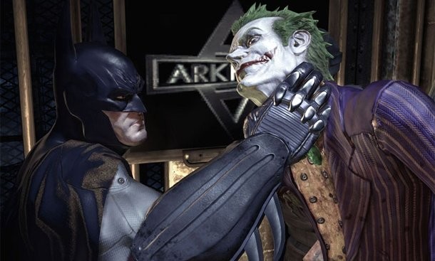
Hyper-realism was the key word used to describe the merging of the iconic comic book style and true-to-life visuals. This was particularly hard to implement when it came to the characters, as the improbable cast risked looking less believable through a real-world lens. Throughout the process creative liberties were taken with some characters, while others stayed true to their original designs. For Batman, Rocksteady chose to make his classic costume look more industrial and military-influenced. The Joker was a bit more complex and harder to translate, but the team is happy with how he turned out. Harley Quinn was one of the team's favorite redesigns, as they were given permission to push her in a different direction than she is usually depicted. Hego noted that change is always a scary idea with licensed characters as the new look will ultimately endear some and alienate others.
In Arkham Asylum the environment became a character itself, a clue that the team made good design decisions along the way. One of the goals for architecture was to infuse history into the buildings and Rocksteady did this by playing with Gothic and Victorian styles. Verticallity was also paramount to the visual style – and to gameplay. The team also worked hard to integrate crooked lines into the environment whenever possible. This technique was applied to trees, drain pipes and more.
Fans of Arkham Asylum would probably agree that while many of the facilities on the island are functionally similar, the Rocksteady team managed to infuse personality into each new location. Key words were used to help define what each environment would look like. The Maximum Security area was intended to look industrial Gothic, claustrophobic, retrofitted and like a bunker. The Medical Wing needed to inspire horror, use metal work, employ verticallity and host more Victorian elements. The Catacombs aimed to feel oppressing, focus on the earth and use brickwork. This type of differentiation helped the team flesh out 40 rooms, 34 corridors, 3 exterior maps and 3 Scarecrow maps.
Arkham was developed in a relatively short amount of time, and the team credits this with the modular design of the environments. For each location they created a set of assets and then built the environment as if using LEGOS. Hego said that this approach not only was time effective, but resulted in a believable, industrial look. In these areas, lighting became infinitely important. Light was used to draw the eye to points of interest, and to draw the player forward in "boring corridors." Light also allowed for shadows and darkness, an integral part of the visual presentation and gameplay.
Rocksteady seemed to embrace the pressure on them and succeed in spades, producing a game that not only paid tribute to the comic book origins of the franchise, but also set a benchmark for the future Batman entertainment properties.

Popular Content


Get the Game Informer Print Edition!
Explore your favorite games in premium print format, delivered to your door.
- 10 issues per year
- Only $4.80 per issue
- Full digital magazine archive access
- Since 1991