Exclusive Mega Man 11 Concept Art Gallery

For Mega Man 11, Capcom is updating the Blue Bomber’s iconic design. However, the character has a 30-year history, and fans have come to expect a certain look from the Mega Man franchise. We spoke with artist Yuji Ishihara about how he gave Mega Man 11 its anime-inspired look while holding true to the series history.
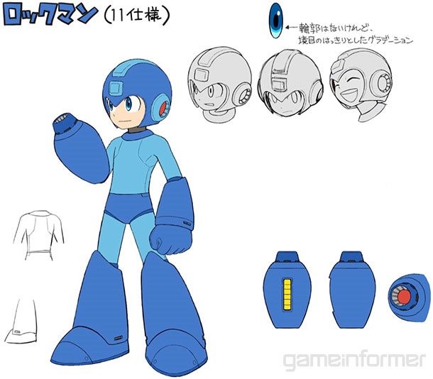
On Mega Man's New Design: “We were going for more 3D look, so I felt like I should include more details to really show off that he is a robot. One of the biggest changes is the separation of the joints in the wrist and ankle. I noticed that anytime people draw fan art of Mega Man, the anatomy of drawing the hand with the entire wrist and arm was difficult. With the separation, I figured that if I’m fortunate enough to have people draw fan art of this version of Mega Man, they would have an easier time.”

On Robot Master Weapons: “In previous iterations, Mega Man went through a color swap, but I decided to have him go through a more physical change. I thought that seeing an actual visual change would make acquiring a new weapon more exciting. I thought with an extra visual change, people might grow extra attachment to certain weapons. I contemplated having Mega Man go through a more dramatic change, or maybe combining him with his allies Rush, Beat, or Eddie, but when I did complete overhauls like that, it actually looked closer to Mega Man from the Battle Network series, and I felt like that was just not the right direction to take.”
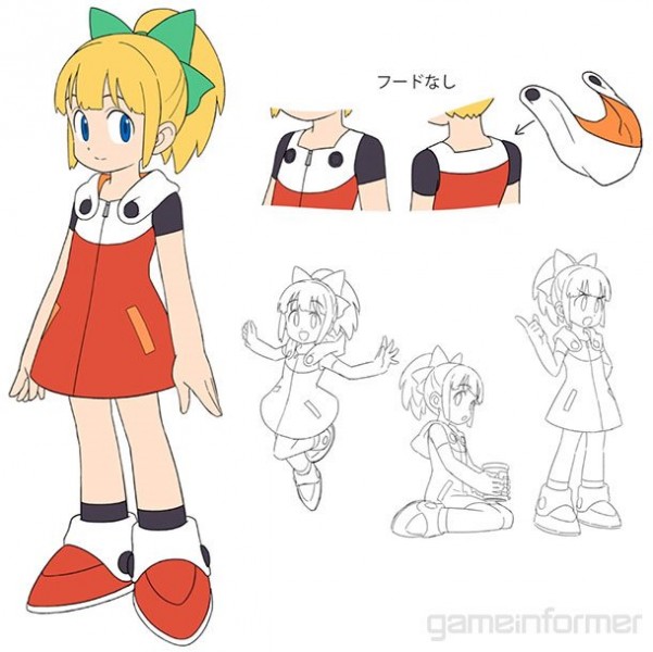
On Mega Man's Sister Roll: “We wanted to make sure that we didn’t change her look too drastically, but we want to make sure that she still looked like Mega Man’s little sister, so a huge emphasis was on that hoodie portion. I feel like that did a good job of giving her a younger feel.”

On Making Enemies Cute: “I wanted to make it so that when you fight the enemies individually it brings a smile to your face, ‘Oh that’s cute.’ But at the same time, when you complete the game and fight them as a whole, I want players to look back and think, ‘That was really cool and fun.’"

On Simplifiying Colors: "When I looked at the enemies for Mega Man 7 and onward, I felt like they had more color variety, but the individual personalities of each enemy was lessened because of that. I cut back on the number of colors for the enemies, so you can really see the distinction between each enemy. I don’t want players to be sad when they defeat enemies I kind of envision it as they’re all having fun on the playground.”

On Stage Creation: “I initially thought about how to evolve the look in a way that was different from the evolution Mega Man had going from the NES to the SNES. Was there a different way to evolve the look from what happened there? However, since fans had been waiting so long, I didn’t feel like that updated retro look was appropriate. So we took images from old games like Mega Man 5 and 10 and did hand-drawn images over the top, trying to recreate what made them cool while adding more detail and making sure the backgrounds were still comprehensible.”

On Getting Mega Man's Perspective: “This is the first image we did after we settled on the look of the game. For me, it’s all about how the place looks when you’re standing there yourself. Even if this is the visual look of the game, I still wanted to imagine how the surroundings will look from Mega Man’s perspective.”
To see our entire month of Mega Man 11 coverage, click in the banner below and bookmark our hub. We'll have several stories to add to it in the coming days and weeks.

Popular Content


Get the Game Informer Print Edition!
Explore your favorite games in premium print format, delivered to your door.
- 10 issues per year
- Only $4.80 per issue
- Full digital magazine archive access
- Since 1991