
007 First Light headlines our newest issue about the most anticipated games of 2026 and beyond. Subscribe now!
Blizzard's newly minted Overwatch League is taking the esports scene by storm, but which team is the best of the best? G.I.'s most prolific and professional analyst is here to rank the competition by the only criteria that matters: their logos.
Normally when I present a ranking in one of these dumbs columns I go through a whole link-laden song and dance to prove how obviously qualified I am to judge the topic at hand – and today is no different. However, unlike my recent Dragon Ball FighterZ ranking (which received STUNNING praise from readers), I actually know something about Overwatch! In fact, I've already ranked every single character in the game*, so you could say that I'm as much of an Overwatch professional as anyone in the Overwatch League. I still don't know why Blizzard didn't invite me to join, but I won't let their insulting oversight taint my opinions.
Anyway, is that enough links? Cuz it doesn't really feel like enough links. Just to be sure, here's a ranking of all the 1, 2, Switch games Joe made me play, as well as the Top 10 Funnies To A Points** – See? I even rank myself!
Without further ado, here's my ranking of every Overwatch League team, based purely on their names and logos – because without those they're just a bunch of random people playing Overwatch!
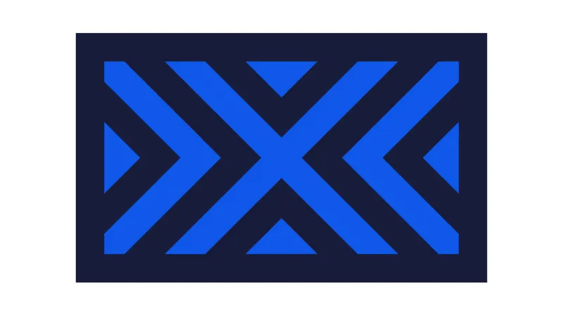
Good lord, what a logo. My first thought about the New York Excelsior – after I recovered from the seizure their logo gave me – was that they named the team after King Arthur's sword, which is a solid choice. Then I realized that's the Excalibur. Excelsior, on the other hand, is Latin for "ever upward." That's pretty good too, though it could potentially mean they're in last place and have nowhere else to go but up – i.e. "ever upwards because we literally can't drop any lower."
Anyway, New York's team is comprised entirely of Korean players, and I'm guessing they're also the best players in the world, because buying the top talent is totally the kind of thing New York would do – it's still the first season and New York has already ruined the league! Too bad they didn't spend millions of dollars on a better logo – those "X"es are hurting my eyes!
Final Rating: The New York Yankees of Overwatch – and that's not a compliment!

The Dallas Fuel logo is just a flame. Or is it a wing? Nah, it must be a flame. Either way, it looks like someone jumped into a random Bethesda character creator, selected the first face tattoo decal that no one ever chooses, and said, "Yeah, that works! Wait, make it blue. Perfect!" Also, should a team named Fuel have a flame as their logo? If video games have taught me anything, it's that Fuel + Flames = Uncontrolled, Devastating Explosion 100% of the time.
Final Rating: Explosively bad

Well see, Dallas Fuel just seems outdated now, doesn't it? They're running on flames while Philadelphia is in the nuclear age! However, as far as atom symbols go, that one's pretty weak, and the "P" in the middle of it makes we want to say "Philadelphia Pew-sion." And now that I've said that, you'll never be able to look at that logo and not think "Philadelphia Pewsion" ever again. This is why everyone should consult with me before naming things!
Final Rating: Doesn't pass the smell test

London Spitfire's logo looks like the kind of insignia you'd see on a World War II bomber jacket. That's cool and all, but what's with the plane? There are no planes in Overwatch. Are we sure this isn't some kind of naming mix-up, like American football vs. rest-of-the-entire-world football? Like maybe there's a plane-based sport that's called Overwatch in London and their team is comprised of 12 super-confused pilots? I don't know, I'm just spit-balling here – which is a word that's very similar to "spitfire." Coincidence? Or CONSPIRACY?!
Final Rating: Meh

The San Francisco Shock logo is certainly stylish, but it could very much be the logo for San Francisco's public transportation. Admit it: You wouldn't think twice if you saw that slapped on the side of a bus. That said, Shock is an objectively wicked name for a team. The spikes on the bottom look like the Golden Gate Bridge, which is a nice touch, and Reiner suggested they also look like the spikes of a tremor on the Richter Scale. That's some next-level logo design – though maybe a city built on one of the world's largest fault lines doesn't want to be reminded of earthquakes every time they cheer on their home team?
Rating: Still better than public transportation

First things first: I'm not a fan of a team name being an adjective. Teams should definitely be nouns, like the Bulldogs or the Bullfrogs or the Bull...s. But L.A.'s logo is cool regardless, and looks like the helmet of a warrior who could certainly be described as valiant. Wait a minute – is that just Symmetra's headgear? It is, isn't it:
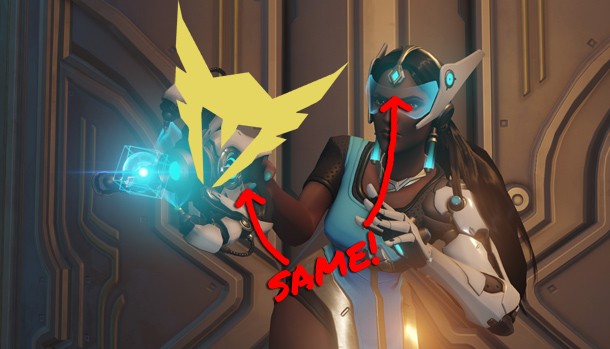
Oh well, I like Symmetra anyway – I once set up a bunch of drones in a small room and killed like a dozen noobs in a single match. Go Valiant(s?)! See, it really shouldn't be an adjective.
Final Rating: A...valiant effort? BWAHAHAHA!

We're definitely getting better, but still not quite there. I like the way the logo incorporates the "M" into the larger image – but what's up with the wick being a palm tree? I mean, I get that the team is located in Florida, but that's just confusing. Also, it's extremely risky to make your team logo a bomb. Especially when you're 1 and 9 in the season. I Also just realized their logo could accurately be described as "the M-bomb," which ain't great either.
Final Rating: Problematic on multiple levels

Alright, we're clearly in a new tier of logos. The Houston Outlaws logo plays off of the Houston Texans logo – in fact, I think every Texas team is required by law to have a steer and a star in their logo. However, the Outlaws turned the familiar imagery into guns! Normally that would seem needlessly aggressive, but it is a shooter after all, so they can get away with it.
On the other hand, however, their team name is basically calling themselves criminals, which is a little weird. What if they get unfairly accused of cheating in the future? No one is going to believe the word of a self-proclaimed outlaw!
Rating: Admissible in court!

Hey, now we're talking! A big tiger head! That's awesome! However, I gotta say, the bar is pretty high for tiger sports logos. Just look at all those! Seoul Dynasty is downright tame compared to them – in fact, he kind of looks like an old, sleepy tiger, doesn't he? Not want you want in a hyper competitive esport played by teenagers. Also, calling yourself a "Dynasty" is kind of presumptuous – it's the inaugural season, for crying out loud!
Rating: Could be fiercer, but still gets tiger points

Boston Uprising's logo is very smart. It weaves the two letters from their team name into the logo, and makes the whole thing look like a shield. Granted, it could also be mistaken for one of the countless icons littering the map of any Assassin's Creed or Far Cry game, but all in all it works.
My bigger issue with Boston Uprising is the team name sounds like a historical event. I bet a social studies teacher could trick the crap out of their students. For instance:
What was the name of the 1773 rebellion between the Thirteen Colonies and the British government that spawned the American Revolution?
A. The Boston Massacre
B. The Boston Uprising
C. The Boston Tea Party
D. Genji Suckz LOL
All kinds of dumb kids would fall for that one, and then they'd be impressed by how hip their history teacher is! Actually, I think I like Boston Uprising even more now. Any American history teachers can feel free to include that one on a future quiz.
Final Rating: Deceptively Good

Ugh, of course L.A. has two teams – just like the Lakers and the Clippers, which I totally knew off the top of my head and didn't have to google. However, there's no denying how cool the Gladiators logo is. You've got a sick-ass lion on the front of a gladiator shield, which ties into the name of the team, which is also a NOUN. Granted, it does have a lot in common with the Thundercats logo, but that doesn't really make it any less rad now does it?
The only problem? It doesn't incorporate the letters of the team into the logo like some of the fancier teams do. Still, topnotch.
Final Rating: Almost Perfect

This is it, folks! The Shanghai Dragons have everything you could want! A name that's a noun? Check! Cool animal in the logo? Can't beat dragons! And not only does the image tie into the name, it's also shaped like an "S" for Shanghai! Plus it's got flames shooting out of its tail for some reason! The ass flame alone is basically Fuel's entire logo – talk about one-upping the competition! I'd write more about how awesome the Shanghai Dragons are, but I've used up my entire exclamation-point quota for the month in this paragraph alone! And I regret nothing!
Final Rating: Clearly this is the best team in the league – no need to run that fact past the current season standings!
*Well, technically not the latest DLC characters, but you can slot them all in at the bottom because CHANGE SCARES ME
**I still don't know how the hell to pluralize that


Funny To A Point is Jeff Marchiafava’s column that celebrates the random, humorous, and downright stupid things that make gaming so much fun. It runs bi-weekly on Fridays.
Explore your favorite games in premium print format, delivered to your door.


