Please support Game Informer. Print magazine subscriptions are less than $2 per issue
Borderlands And The 11th Hour Art Style Change
The Borderlands we've all come to know and love is a drastically different beast than the one that debuted in our magazine. In a recent panel hosted by Gearbox Software, key team members clued us into why they opted for a complete visual overhaul so late in the development process.
To give some context to the decision, they first provided an outline of the project pipeline.
The Timeline
Concept: April 05 - October 05
Prototype: November 05 - October 06
Development One: November 06 - August 07
Development Two: September 07 - October 08
Final Push: October 08 - October 09
Three-fourths of the way through production, Gearbox head Randy Pitchford approached publisher 2K with a proposal - a complete visual redesign of the game. Expecting the worst, Pitchford was surprised that 2K agreed that the change was needed, excited by the direction Gearbox proposed. Why did the developer and publisher agree that such drastic measures were needed?
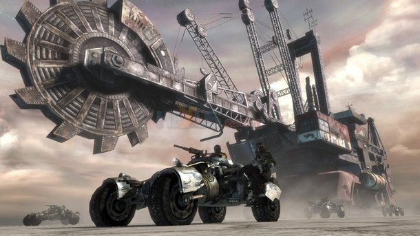
(original Borderlands screenshot)
The Purple Cow
How did the team justify the change? In a sea of "brown games," Gearbox worried that their title wouldn't stand out. Thinking about its reception, they began to wonder if it would simply look like "a poor man's Rage." They needed something to grab the attention of potential customers - a purple cow. Seth Goodin's book Purple Cow instilled the mantra "be remarkable, or be invisible," in the team.
The decision wasn't only influenced by aesthetics, however. Gearbox worried that the art style and gameplay contradicted itself in a way that couldn't be reconciled. Borderlands hosts player characters that can jump well beyond human limitations, and bad guys explode when shot. They decided that a more exaggerated art style would allow them to move forward without divorcing these entertaining gameplay elements. Lastly, Gearbox reasoned that the decision would improve the overall quality of the final product because when teams have varying levels of talent, it's hard to maintain a standard of quality in a photo-realism approach.
A New Direction
The change wasn't an easy one. Gearbox confessed that the massive redesign
demoralized the original art director to the point that she left Gearbox and now works in a different field entirely. Still, the
move felt correct to the bulk of the team. The new design style was decided by committee, giving those invested in the project a chance to voice their opinion. Goals included a fresh approach that would be standout, fun, break plausibility, kick realism out the window, and, of course, be beautiful. A retro influence was chosen and color was noted as being of high importance early on. Words like "attractive, fun, colorful, stylish, animated, and unconventional," helped to funnel ideas into Borderland's final form.
The Process
In order to maximize efficiency, the all-encompassing "Art Director" position diversified into several more specific jobs - Art Director, Art Producer, Out-sourcing
Art Director, Art Lead and Lead Environment
Artist. Also, they implemented a "Merry-go-round" approach - making sure that all team members were pushing in the same direction.
The Results
Borderlands has been a critical and commercial success and the team believes the redesign was imperative in this regard. Ultimately, changing the style afforded Gearbox more freedom. As a result they were able to exaggerate character design, flesh out weapon customization in fantastical ways and keep the game humorously visceral. While the effort was a major gamble, it paid off.
What do you think? Was the change well worth it? Or did you prefer the original style?

