Grading The Fakes: PlayStation 4
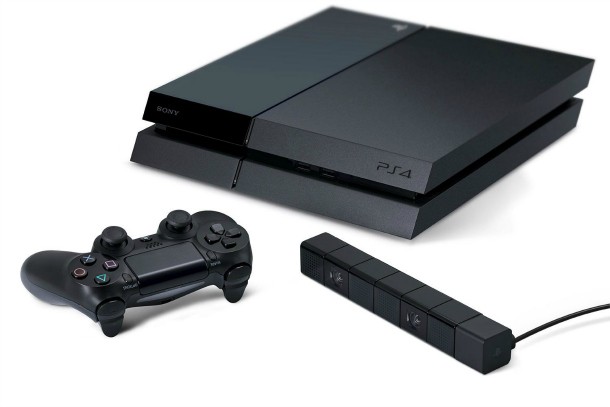
In the run-up to any new console, there's a deluge of fan-created concepts and bogus "leaked images" of the hardware. Now that the PlayStation 4 is almost here, we decided to look back as some of the best and worst of the fakes. The final unit (pictured above) has been received well by gamers; it sticks with Sony's traditional black and minimal designs while adding a parallelogram twist and a great new controller. Read on to see some of the proposed hardware designs that have circulated on the Internet in the past few years and how they stack up to the real thing.
NOTE: When possible, I have tried to credit the designer of these images. If you are the designer of one of these please email me and I will add a credit.
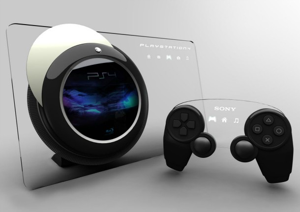
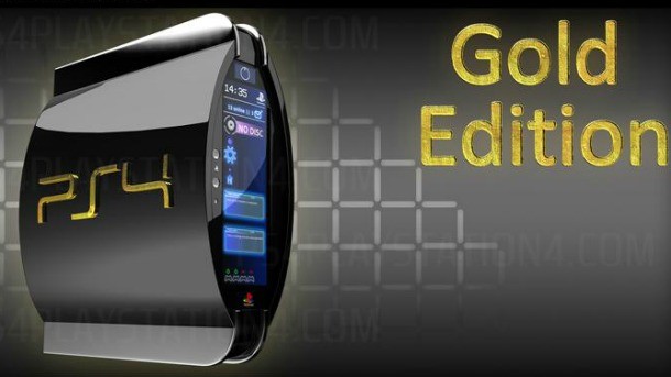
It Came From Space
This is one of the more daring designs. On the believability scale, it's very low, but a guy can dream, can't he? A flat glass panel with an orb-like center that recalls Hal 9000 from 2001: A Space Odyssey, it's also got a controller that seems to have attached a clear plastic touchpad to two conventional Dual Shock wings. While this wasn't fooling anyone, as a design exercise, I really like it. B+
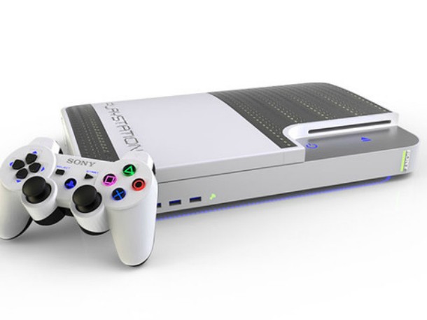
All White Everything
The console design on this one isn't really that far off from the actual unit, and definitely fits in line with Sony's traditional industrial design. Using a white Dual Shock as the controller isn't very creative – but betting that Sony was going to reuse the controller once again wasn't a bad bet. However, I never thought Sony would go with a white unit. Still, it's not bad and I like the insets, which look to be woven carbon fiber of the kind you see on hoods of sports cars and racing vehicles. B-
Plain Jane
This mock-up PS4 isn't exactly risky – it's always been likely that Sony's next system was going to be a black rectangle of some sort. I actually like the rounded edges, but overall this isn't a very inspiring console design. The artist did try to incorporate a touchscreen into the controller (the real controller has a touchpad) but by placing it above the normal Dual Shock it basically makes it an input that would be good for menu navigation and not for gameplay. Still a touchscreen with an actual display would have been a nice feature to see in the real console. C-
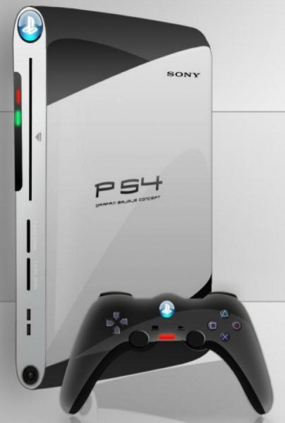
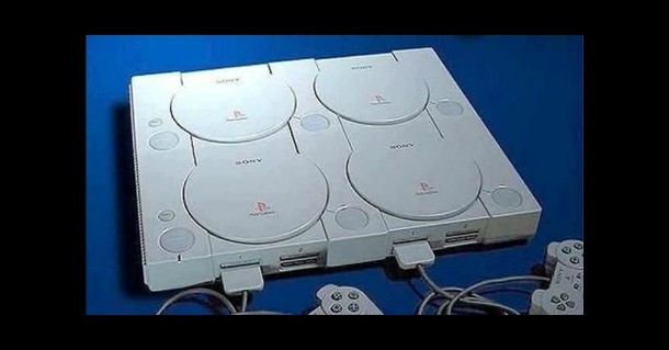
Return of the Boomerang
[Design by Darpan Bajaj]
The console unit seen above isn't particularly interesting or attractive, but I do like the curved ends and the use of white and black. However, it is a trip down memory lane. The controller seen here posits that Sony was to return to the infamous "boomerang" controller prototype that was actually shown at E3 by Sony when it first unveiled the PlayStation 3. None of which explains how this unit is sitting upright without a stand. D
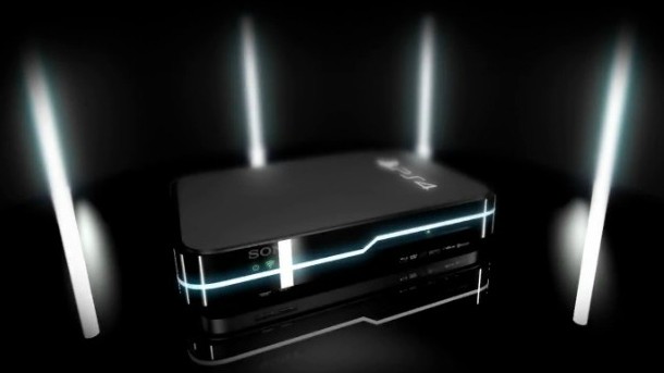
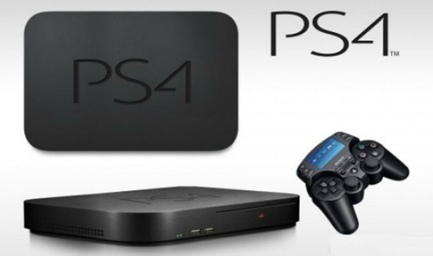
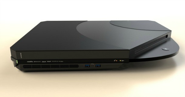
The Fake That Fooled Us
This is the fake unit that got the Internet talking, for a couple of reasons. One, because it's a pretty cool looking unit, and seems like a fairly plausible design. Two, because it was used in this remarkably real-looking fake Sony promo video. As far as fakery goes, this is pretty high level stuff. It's also a great design, and I like it better than the eventual design (love the light up band across the middle). A
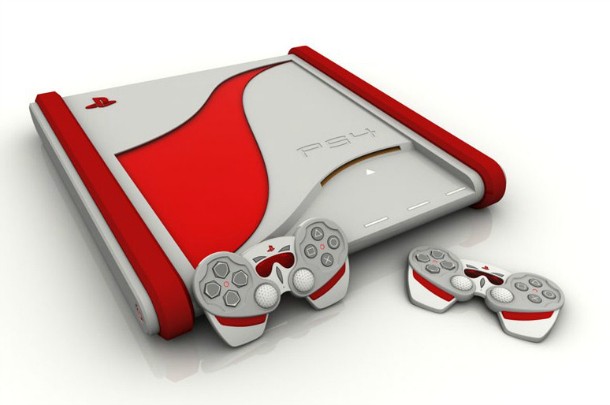
The Big Red One
I have an odd affection for this one, though there was no way in hell this was the actual design. This red-and-gray number reminds me of some oddball race-car inspired console, or a weird Roomba. This design's Achille's heel is its controllers, which look weird, misshapen, and uncomfortable. While it's fun to look at, this isn't a very effective concept image. D
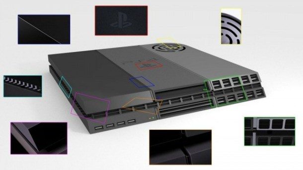
Built From The Teaser
This is an interesting attempt. As you can see, it looks very close to the final unit, but as if it were assembled, Frankenstein-style, from odd parts. There's a reason for that. This image was actually compiled by Internet users based on the first official teaser trailer for the PlayStation 4. The trailer only showed small, brief flashes of the system. However, that was all that was needed for online sleuths to assemble this image. While it's pretty ugly, it is impressive how they managed to get the basic dimensions and shape of the unit right. B
The Space Age Toaster
This one is pretty silly. It's weird, upright shape reminds me more of some sort of "Smart toaster" (maybe you can start toasting bread with a smartphone app?) than a game machine. This also falls outside of Sony's usual aesthetics, making it another one that wasn't remotely accurate, but not really interesting as a design exercise, either. However, I do like the idea of having a touchscreen on the unit itself, even if – in the real world – that would probably be an unnecessarily expensive bell and whistle. D
The Best For Last
[design by Joseph Dumary]
I love this proposed PS4 design. Joseph Dumary absolutely hit it out of the park, to the point where I wish this was the real unit. First off, it's the most plausible looking, staying in the spirit of Sony's traditions while feeling fresh and taking a few chances. Also, unlike many of these designs, it could easily fit into a entertainment center console. I like everything about this: the clean lines, the cool offset "swoosh" on the top, the diagonal cut and rounded canteliver beneath the disc drive. Great work. A+
Everybody's A Comedian
Okay, I admit I laughed.
Popular Content


Get the Game Informer Print Edition!
Explore your favorite games in premium print format, delivered to your door.
- 10 issues per year
- Only $4.80 per issue
- Full digital magazine archive access
- Since 1991