Please support Game Informer. Print magazine subscriptions are less than $2 per issue
Art Of War: Creating Darksiders' Protagonist
Joe Madureira has made a name for himself in comic books (most notably through his Uncanny X-Men run from 1994-1997), and although he's been involved with the creation of a few other games, tomorrow's release of Darksiders is the first game that truly captures his artistic style. As it turns out, creating a video game character isn't as simple as making an illustration and handing it off to get rendered and placed into a game. Joe spent years perfecting the design of Darksiders' protagonist, War. He walks us through this extensive process in an essay he wrote exclusively for Game Informer. Take it away, Joe!
War’s creation turned out to be a huge undertaking. It took over two years, and the involvement of several artists to arrive at the character that you see in Darksiders. With most characters, that’s not usually the case—but I’m willing to bet that with a game’s central character, you rarely nail it on the first try. Here are some interesting, and some downright awful attempts to get it right.
In this version (below), I was thinking something really sleek and deadly. It was important to me that he look supernatural, not like a man in a costume. The blue skin was supposed to lend an otherworldy feel to him, and I incorporated his sword into his arm. The sword-arm was originally going to be his signature weapon, but it presented a few problems. One of them was animation related, you just can't get as nice a range of motion when the sword pivot is at your elbow versus in your hand which rotates at the wrist. We ditched the sword arm idea, and we eventually decided this overall look was too alien. And…really, not that cool. FAIL!

I honestly don’t even know how to explain this drawing. It seemed cool at the time. Now, he sort of looks like a kid in a suit. Originally, War was going to be a lot sleeker, quicker, he had moves like wall-run, and was more ninja-like in general, so I kept the armor fairly minimal, except for the giant arm, which served as sort of a shield/power source. The armor was a mix of leather and cloth, with the arm being the only metallic/heavy element. We kinda liked the hood, it made him mysterious, without taking away his face fully, like a mask would. Decided to take this one further.


This more fleshed out version of the armor got us pretty excited. You’ll notice I still hadn’t quite figured out his sword, the Chaos Eater, and it’s looking a little generic in this shot.

So we built this version of War, and it was enough for us to start running around with and begin working on the gameplay/combat.


There he is! And check out Ruin. Hard to believe they started out this way! Before we took the armor all the way, we had to lock down the proportions for War and Ruin, and make sure nothing on his armor conflicted with his mount. So far so good. Unfortunately, as we ran around with him, more and more we felt like he looked pretty unimpressive, and generic. He was deemed "just another guy with a sword" and we started getting some pressure to display some of the game’s modern elements like guns, tech, etc.


That’s when ‘future war’ came about. I did this piece, and we all got pumped. You couldn’t look at this guy and think ‘guy with a sword’. We ran with it.


We started building him out. By this point, our character art took a big leap, and he was feeling really awesome. Way bigger and more impressive than the original.


The game-ready asset looked pretty cool. Emissive textures to add interest and help him stand out in dark areas, cool varied metals on his armor surface. We were loving this guy. Again though, as we ran around with him, we would constantly snicker about how he looked like Robocop. He got a little too futuristic, and didn’t feel at all like the character we were envisioning as a Horseman of the Apocalypse. Still, we had done so much work on this guy, we decided to keep it. For a while. Eventually, we couldn’t stand Robo-war anymore.


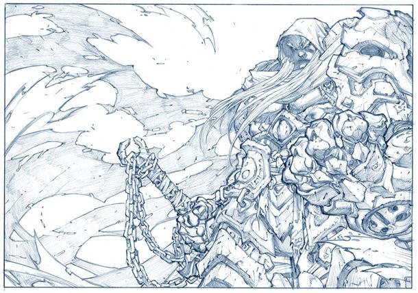
I did this illustration, where I just focused on making him the biggest, most badass ‘Ancient Warrior’. I wanted every facet of his armor to have interest and history to it. Worn and battered. Like he’s been fighting for centuries. We all kind of agreed—this is the ONE! In a way, we had circled back to our earlier idea to go really fantasy with him, and ignore the ‘guy with a sword’ comments.

Each time we decide on a direction, we generate ‘turn-arounds’ which allows the artists to get a detailed view of the character from every angle. As a concept artist it also helps to visualize the character in this way, because some things don’t look as cool from every angle.

Normally, you wouldn’t focus on a character’s back that much. But in games, this is often the side of the character you see most.


Once the concept was finalized, I laid some basic colors down. This is extremely close to the version you see in the game, though some of the armor had to be lightened up to make the character more visible against the environments.


And there he is in all his glory!

I’d like to ask you to support Game Informer’s continued coverage of games with a subscription. For less than two dollars per issue, we mail you a full year of 10 print magazines, each with cover stories and preview features filled with exclusive details about the most exciting upcoming games. We profile and interview game creators. We look back on the rich history of gaming, and we celebrate what’s next.
Here on the website, we offer much of our content for free, including game reviews, daily news, videos, event coverage, and more – all with minimal ads.
We do so with a small editorial team, alongside contributing paid writers from around the world – over 65 individuals from 9 countries around the world, just in the last couple of years.
It’s not possible without support.
In a time when game makers and games coverage have faced hard struggles and layoffs, the future of this 30+ year magazine and community is at risk. Our new standalone magazine subscription is the number one way you can keep us alive – and we believe you’ll get a pretty fantastic gaming magazine in your mailbox every few weeks for your trouble.
Thank you.