Switch Lights

The lights are on

What's Happening

Why I Hate The Xbox 360 Dashboard: A Photo Journal

The "New Xbox Experience" launched two years ago, replacing the 360's old sliding blade dashboard with a slicker and more colorful interface. While it may have been a visual step up, I initially had reservations about the funtionality of the new format. Over time, these reservations have blossomed into a full-blown hatred that burns like the sun whenever I need to navigate my 360 while  connected to Xbox Live.

Excuses like "you just don't like it because it's new" and "they're still  working on it" no longer hold any weight. Microsoft should have had this garbage sorted out ages ago, and the fact that they haven't means that it is intentionally cumbersome, intrusive, and frustrating. Plainly put, the Xbox 360 interface is abominable, and I'm surprised more people aren't furious about it.

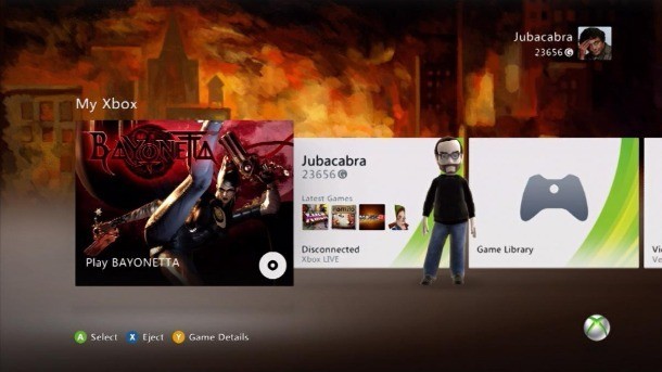
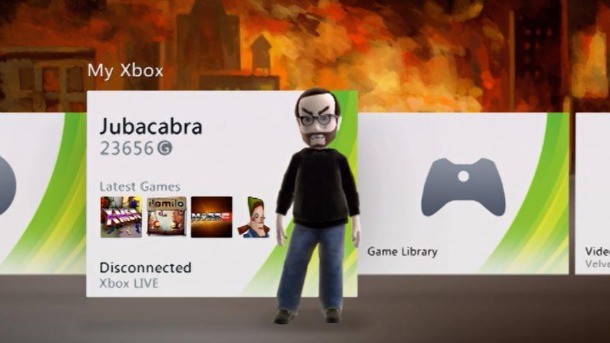
Here's what it looks like when you're offline. One channel, no ads. Whatever is in your disc tray is front and center. Of course, you can't access your friends list or anything, but at least this is a streamlined approach to using your console. Don't let the "My Xbox" name fool you, though; this channel doesn't give you any way to customize the items it contains.

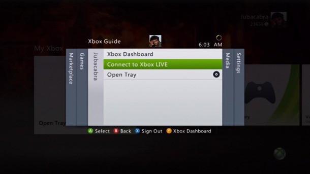
Now, the second you try to connect to Xbox Live...

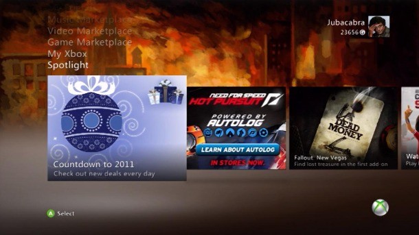
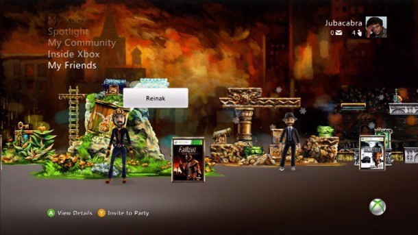
...you get this jumbled mess. The default channel changes from My Xbox to Spotlight. I don't know about you, but the first thing I want to do when I turn on my console is watch a bunch of sponsored promotional bull----. Not, you know, play games. Who even watches this stuff, anyway?

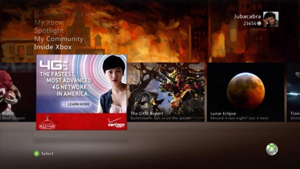
I don't know what the difference is between the Spotlight and Inside Xbox channels. They feature redundant content, which mainly includes advertisements, old previews, and useless "tips" for games no one is playing anymore. Also, I already have to put up with ads on TV, radio, and websites...but I feel like it's crossing the line when I see them as soon as I boot up my game console. Did you ever have to watch a commercial when you put a cartridge into your NES?

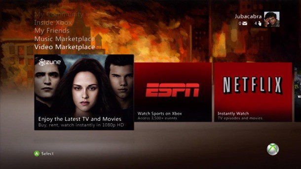
Isn't that cute? Microsoft thinks people give a crap about Zune. I respect the company's right to hope against hope, but I'd bet the vast majority of users only visit this channel for the Netflix application. If you're not going to make  that the first option by default, at least give me the ability to put it there myself and bury the Zune app at the far end of the channel where it belongs. I bet 99 percent of the people who select the Zune thing here do it accidentally on the way to either ESPN or Netflix. I know that's happened to me.

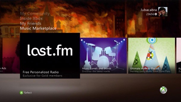
Honestly, I never use the music channel. It's just one more stupid thing I need to scroll through to get where I'm going. I don't understand why I can't hide the things that I don't want to see...

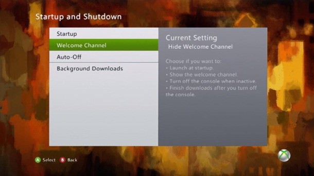
...I know it's possible, since the system lets you hide the Welcome channel, but you're stuck with all of the other ones. Then again, if you were able to hide the Inside Xbox channel, you wouldn't have the opportunity to learn all about Verizon, right?

It's been said many times in many ways, but I can't talk about what sucks about the Xbox 360 without adding my voice to the chorus: Avatars are really, really dumb. I hate looking at them. I hate that I need to have one. I hate that I can't turn them off. I hate Avatars so much that I never use the side-scrolling friends channel. Instead, I just hit the guide button and check out my friends' activity through the old blade-style list.

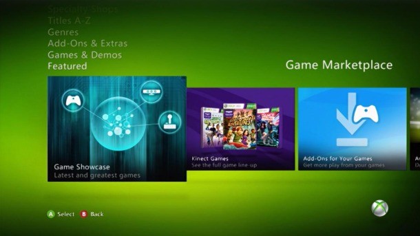
Let's take a quick look at usability. What happens when you try to do something simple? For example, if I've bought a card for another year of  Xbox Live Gold service, how do I redeem that? Maybe in the game marketplace? Nope.

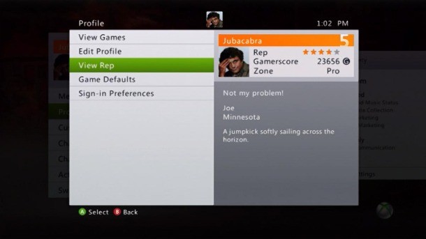
Is there some kind of account management in my profile? Nope. (Side note: I miss the days when people saw Columbo next to my name instead of my stupid Avatar)

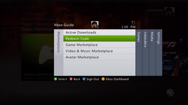
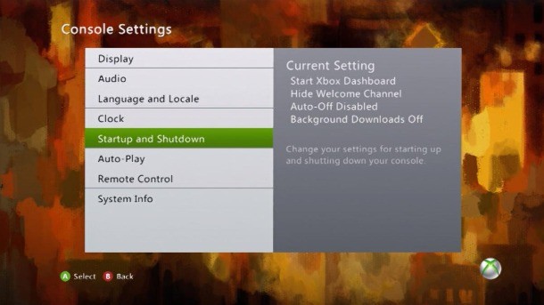
You have to hit the guide button, then scroll over to that version of the marketplace. That's the only place I've found where you can redeem codes...buried in some secondary version of the interface.

Or, let's say that I'm watching a movie, and I'm sick of those notifications popping up telling me when my friends are online. How do I turn those off? Settings? Oh, no. Because that would make sense.

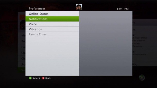
Again, you need to press the guide button, scroll over to those settings, then select the "preferences" tab there that, for some reason, doesn't exist in the main interface.

Well, that's my abbreviated rant about why I hate the 360 dashboard. In the interest of not fanning the flames of a console war, I should say this: I don't have any anti-Microsoft agenda . I'm not complaining about the 360 to make the PS3 look good. The only reason I'm not also complaining about PlayStation Home is that I've rarely used it. But at least Sony has the good sense to not impose Home's lameness on every user, whereas every Xbox Live subscriber has to put up with this crap.

Here's what needs to happen to make me happy: Microsoft needs to give me control. Stop forcing me to scroll through multiple channels populated with content I don't care about. By all means, keep all those dumb channels if you have to, but let me move them or hide them so they aren't what I see before the channel I use to play my games on a video game console. On that note, please stop making the system default to the Spotlight channel. No one wants to watch any of that trash. Instead, let me take my favorite destinations, like Netflix and Xbox Live Arcade, and add them as shortcuts to the main My Xbox channel. Let me, not Microsoft, decide how I should be using my Xbox 360.

Email the author , or follow on , , and .

Comments
  • Huh, I'm not in love with the interface, but I think it's OK.

    Though to be honest, I can't remember what the interface looked like 2 years ago, before the "New Xbox Experience" came out.
  • Mod
    And on top of that, it is a paid service that they're shoving all of those ads into.
  • I'm not an Xbox Live user nor do I even have an Xbox 360 so I can't really agree or disagree with you but from your information about this interface I can say that it does seem pretty bad.
  • The one thing I STILL don't understand about the Dashboard is why "My Friends" is five or so places above/below "My Xbox". I'm more than anything, going to want to see who is online, what they're doing, if I can join a game, etc. Microsoft are keen to make the Xbox 360 a family entertainment unit and a social unit yet that one little thing seems to evade them - My Friends is lightyears away from "My Xbox". As for the other channels, I agree that there should be an option to remove the channels you don't want or shortcut them (granted they'd probably complicate that) and a lot of options to get to are rather cumbersome. Still, I like the avatars and I've got used to the NXE but that doesn't necessarily mean it can't be improved and the recent update was a great chance to improve upon it but they unfortunately didn't even try. Here's hoping the next NXE update will improve the experience.
  • Well, they have to justify the $60/year somehow... But you're right, some of the stuff is really stupid. There's at least 3 different "Settings" menus, stuff doesn't seem to be where it should be, and as most people can probably tell you, there's no simple way on the dashboard to cancel your Gold account. You are a slave to their whims unless you set aside time to call XBox Support, and I'm sure they''ll sit there and bother you to stay, much like the old AOL days.
  • I think that'd drive me crazy... That's why I'm a PC Gamer.
  • Way to go Joe (unintentional rhyme. Yes! :D)! I totally agree. For a company that's praised for how user-friendly their interface is, I've always felt as though the 360's dashboard was just frustrating. Plus, they didn't even really fix anything with the most recent update, they just made the dashboard looks sexier (The dashboard does look hot, I'll give them that much). Unfortunately, the sexy is imbalanced by how much attention is drawn to the butt-ugly avatars. When you see people online, you should see how they choose to represent themselves as gamers, not how they are forced to display themselves with poor representations of their actual characteristics. Seriously, I don't think I've seen a single avatar that actually looks like its user, mine included (although, Joe (another unintentional rhyme! I'm on fire! :D and yes, these are parentheses within parentheses), your avatar does actually look like you. The angry eyebrows totally work lol). Also, the only thing that would convince me to keep the "Spotlight" channel is if they replaced the ads and mind-numbingly boring "commentators" (if you can even call them that...) with things that the gaming community actually gives a rat's *ss about (like Machinima/OpticGaming/MLG/Gaming Magazines/Achievement Hunter (I don't know if the entire gaming community cares about Achievement Hunter, but they should)); and even then, they shouldn't have that be the channel that you see when you turn on the console. At the very least, they should let you organize it to your liking. As for the music/movies channel, they can do away with those. Instead of that, they can just add Netflix to the My Xbox channel. I don't think anyone actually ever visits/uses the music channel, so Microsoft can free up some clutter by doing away with that all together. The only thing that would really get people to use the Music channel is if Apple and Microsoft joined forces to allow people to access their iTunes from their consoles, but, sadly, that's probably never going to happen. Holy crap. I just realized how long this comment is... Anyhoo, you get the gist of what I'm saying. So... I'm gonna go get completely pwnd in black ops :D
  • I actually think the interface has come a really long way and I like it. Don't get me wrong, theres much room for improvement but, I like it none the less. It would be nice if they made more customizable features for users as some parts are a bit cluttered with ads and useless dribble. I have a PS3 as well but, I'm pretty brand new to their system and interface so I don't know enough and haven't played around with the PS3's interface enough yet to choose a favorite. However, I understand where your coming from with this.
  • I personally like the changes, it's much better than the old dash IMO. I guess it's just one of those things that's a matter of opinion. Maybe more people aren't furious about it because the majority of people like it or really couldn't care less?

  • Dashboard is stupid. I only click on my the current game and Netflix. Anything else I get to through the Xbox button (not sure what it's actually called). Avatars are also dumb. I cannot stand seeing "Avatar Award Unlocked" or whatever comes up instead of an achievement. Who cares? I haven't changed my avatar since I was forced to create one, and neither have any of my friends.

  • I completely agree with you, I despise the new dashboard with a fiery passion. I hate hunting through the menus to find stuff, trying to buy anything on the service (not that PSN or the Wii are much better), all the stupid ads no one cares about, how dumb Avatars are, and much more. Its stupid and unintuitive. Nuff said.
  • Lol, If Microsoft gave me the option I would like to have the old dashboard back.
  • Dude... your Avatar looks mean.

  • Your totally right! Scrolling sucks, shortcuts rule. I hate adds. Side note: Microsoft, stop making those STUPID Tv shows that don't tell you anything! I hate SentUaMessages stupid jokes, I hate IGN all together, and that stupid Kinect Show girl pushing her breasts out as far as she can! Well... maybe they can keep that. Wait, No! Just take out everything. VOTE FOR JOE!
  • SO TRUE. I just got my xbox this Christmas and after doing the system update I instantly noticed how annoying these ads are and it's really challenging to find netflix and the games store with all these redundant channels.

  • Well I don't have a 360, but these seem like some irritating things. The only thing I can absolutely agree with is how thankful I am not forced to use Playstation Home.

  • I just hate the newest update, the whole thing looks way to white, and it not as elegant as before. Everything is just a white square, it seems rather lazy to call that an update.

  • Ahhh...I suddenly get reminded of my big brother trying to convince me of how his Xbox 360 is better in every way. Ok, well you see...the PS3's online experience is totally free...we play for free, we use Home for free, we get a internet browser(free two xD) and a whole lot more of FREE, like demos, some themes and every certain day of the week we get to download a certain movie for, yes that's right>FREE
  • No clue why everyone hates the avatars so much. Neglecting the online community, everyone but a select few of my friends loves um or doesn't mind them at all. They help put digital faces to the people we talk to everyday. When I scroll down to my friends, I see a party of my friends, all the avatars doing different animations, all of them looking distinctly different, and without even looking who is in the party I can tell exactly who is there. I guess I will never understand the hate...
  • Eh... I see how some of the things you've listed might be annoying, but they're really just minor inconviences to me. While I did prefer the simple, intuitive blade system, I don't think the NXBLE dashboard is that bad. I'm even glad that some options like redeeming codes are given their own "sub-menus" so that they don't get buried in endless menus.

    Anyway, even though the NXBLE dashboard isn't ideal, I still prefer it to the PS3's XMB. Don't get me wrong, I'm not trying to turn this into a fanboy war. I just can't stand all of endless rows of text. I could deal with it on the PSP, but the PS3 just has too many options to make the XMB work IMO.

    Oh yeah, I HATE all of the ads, though. I can definitely agree with you on that.

1 2 3 4 5 Next