Please support Game Informer. Print magazine subscriptions are less than $2 per issue
Behold The Beauty II: The Unfortunate Sequel
Welcome back.
To those of you who have already experienced the first round of Behold the Beauty and lived to tell about it, I commend you. But seriously, you're back for more? And to those that have yet to witness the sheer brilliance of what is to follow, prepare yourselves. It ain't pretty.
But to the designers that whipped up these "creations" it was precisely just that – pretty. And that, my friend, is pretty amazing in and of itself.
So here we go again. Another batch of covers that, in one way or another or another or another, defy all that is golden when it comes to sound design. They also defy simple logic as well.
Now on with the show:

I figured we'd start off with a bang. Ha! Yeah right...
First take note of the subtle treatment given to the "M" in the title "X-MAN". Clever. Gotta sexy-up that M for good measure just in case people don't notice the half naked woman dominating the cover. Guys must be morons. Wait a minute... ?
Check out the idiot chasing after said half naked woman. Are you kidding me? Look at the stupid look he's got on his face. Not to mention that outfit he's wearing. Play softball much? Where are his shoes? Good thing he's wearing that shirt, otherwise I'd have no idea who X-MAN actually was. I mean, it could be those scissors with legs, that crab, or even the teeth (also with legs). And this is who you assume the role of? How insulting – to both sexes. But what about the scissors, crab, and teeth? How did they get in the game and why? I think it went a little like this:
Tony, lead programmer: "Hey Don?"
Don, lead designer: "Yeah Tony?"
Tony: "We've got X-MAN cruising through these mazes in his quest for, uh, 'treasure', but it's not really all that challenging. Any thoughts on how we can beef up the difficulty?"
Don: "Hmm. How about we throw in some adversaries intent on hunting down X-MAN in his quest for, heh heh, booty?"
Tony: "Like what kind of adversaries? Other like-minded, horny gentlemen? The police? His parents? Rabid guard dogs?"
Don: "Oh no, think much more diabolical. More terrifying!"
Tony: "More diabolical?"
Don: "Yes"
Tony: "More terrifying?"
Don: "Yes"
Tony: "The police?"
Don: "You already said that."
Tony: "I did?"
Don: "Ugh, yes. Never mind. You ready for your mind to be blown?"
Tony: "..."
Don: "Let this sink in: A pair of scissors, a crab, and some teeth."
Tony: "..."
Don: "Brilliant, isn't it?"
Tony: "..."
Tony: "How is that even remotely terrifying or diabolical? I mean, how can scissors or teeth even chase you?"
Don: "They have legs."
Tony: "..."
Tony: "Crabs are pretty slow..."
Don: "This is a fast-moving crab."
Tony: "What's the point? I mean, those three things aren't really that dangerous unless they were to somehow get at your... oh."
Don: "Oh indeed!"
Tony: "Brilliant!"
And it was then that X-MAN was born. Thankfully for us there was never a sequel. How could there be? That combo of the scissors, crab, and teeth was lightning in a bottle. Most game developers should be so lucky.

Jaleco has had some bad covers over the years and the one for Rival Turf! is no exception. What, are those kids like 15? What kind of a gang is this? And what's the deal with the neon blue facade of that building in the background juxtaposed with the nuclear fallout-infused sky? Where is this place? At least they understand contrast to some degree. Is this place supposed to represent their "turf"? How do these kids maintain control of their turf seeing that they're not even out of high school yet? That's a pretty big building. Must be Detroit... or Sesame Street. Where else can can a group of kids wield such power? I like the tough guy on the left giving the fist pump. Wasn't he in West Side Story? And of course, we have exclamation point in Rival Turf!. Because, you know, the game wouldn't exude the same type of coolness and urgency without it. Hello!? Blue building! Enough said.

A well-designed cover is supposed to do a multitude of things: Convey the overall tone and subject matter of the game it's adorning, provide a visually attractive focal point by which to catch the consumer's eye, and, above all else, depict just how fun and worthy of your hard-earned cash the game really is. The cover for the unfortunately-titled Steam Express does none of these things.
Let's start with that title shall we? Steam Express? If I had no visual to go by and just heard the name I'd swear it was either a line of microwaveable meals or a carpet cleaning company. And yet it's neither of those two things. And upon gazing at the wonderful art they came up with, I still can't decipher what the actual "game" is. I see a good amount of steam, an even greater amount of rust (always a key selling point), and a can on the side of the tracks. They're obviously in love with earth-tone colors – namely brown. Way to make it pop. Where do I sign up?
Is that a semi-truck that's been retrofitted to run and act like a train? And if so, why? Are we going to be hauling cargo? Don't trains already do that? What is the point of the game? Perhaps to pick up garbage littered throughout the countryside? Watch out truck/train, you almost missed that can.
This one has best-seller written all over it. Just make sure you're at least three years old. Any younger and you might not get it...whatever "it" is.

How do games like this ever see the light of day? At least the cover aptly depicts what the game is supposedly about. Bonus points right there.
You gotta love the fun the art director had with this particular photo shoot. Check out the golf balls and tees on the ninja's outfit. Now we're talking! But I don't quite understand the whole sword and nunchuck angle. I get that those are typical weapons for a tried-and-true ninja, but on a golf course? What purpose do they serve? What kind of a golf course is this? Is it even really golf for that matter? And what is that mysterious object in his golf bag among his, uh, two woods, two irons, and putter? That's not even close to a full set of clubs. This can't be good.
And look at that sky. Creepy. Is that the moon or a solar eclipse? That sky looks highly polluted. Must be Los Angeles. Not the most ideal conditions for hitting the links. And that's one hell of a slope to that green. Good luck putting on that. You can kiss your chances at a birdie bye bye. Augusta National has nothing on this place.
Good times.

It doesn't get any lazier than this. A cover consisting of a picture of an already-created cover. This one must have been incredibly difficult for the art department to come up with. I especially love the repetition of the Nintendo DS logo, the Teen ESRB rating, and the KONAMI wordmark. Do we really need to see the spine of the original box? We get it, it's a three-dimensional object, but so is the *** box in which this lame cover is a part of! Wait, who makes this game? Oh yeah, it's KONAMI. I missed it the first two times.
Here's a thought: How about just reusing the already fine original cover design and just slapping a "KONAMI'S BEST" sticker on it?
Apparently not.

Ha ha! Yes! Now we're talking!
It's common knowledge that developer Team 17 has a long and storied history of producing high quality, memorable video games and Body Blows Galactic is, without a doubt, their finest hour. Just look at the cover! How could it not be? Although I'm not entirely sure how you deal said body blows to a foe made entirely of flames. That could be a bit tricky. But hey, when you're a Streets of Rage reject paired up with a guy who has the biggest meat paws I've ever seen, anything is possible. Including being attacked simultaneously by some gladiator woman on a flying disc (or is that just a chunk of Earth?), the aforementioned flaming frenzy, a mysterious hooded something-or-other, and a weird imp-like creature riding an equally bizarre horse/miniature dinosaur creature. Wow.
It's plainly obvious that it will take a multitude of body blows on a galactic scale to fend off this formidable bunch. Too bad giant meat paws is already getting flanked by the flying gladiator chick. Epic fail. Thankfully he's wearing shoulder armor. That will come in handy when she knocks him flat on his a**. And what is that imp creature with the long bill looking at? The Team 17 wordmark? Perhaps he's struck by its exquisite design?
And then there's the treatment of the word "Body" in the title. Why is the descender of the "y" made out to be a bolt of lightning? Is that supposed to reinforce the notion of strength, other-worldly powers, or impending doom? More importantly, the treatment and scale of the word really helps to segregate it from the rest of the title for no apparent reason. So in many instances you're left interpreting the title as just "Blows Galactic".
How ironic.

Aside from the ridiculous title – too obvious to even comment on – there are a number of interesting things going on here.
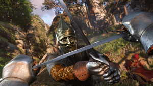
Is there any doubt this cover design was born out of the 80's? Is Punky Brewster on tonight? Hopefully so since I just picked up my latest pair of Zubaz to lounge around in. It's a neon color frenzy! Don't you just love how the publisher's wordmark and accompanying design element of colored lines commands just as much, if not more, attention as the actual game title and associated artwork? What are they trying to market here?
And then there's that illustration of those two people doing... something... meh. Seriously, what are they doing? That guy is dangling the fish like it's a puppet while the woman is offering him an egg? Makes total sense. Might it have something to do with the rooster hats they're both wearing (an obvious tie-in to the game's title)? Who doesn't like to wear rooster hats? I'm completely and utterly baffled by this one.
I know the 80's was a drug-laden decade, but not even Scarface himself could concoct something this bewilderingly lame.
Punky Power!

Poor teddy bear.
He looks scared... and a little beat up from the look of those patches on his head and body. What's he been up to? OD'ing on that jar of honey he's clutching oh-so-tightly perhaps? Yeah, massive quantities of honey will do that to you. The tongue sticking out really hits home the fact that this bear is anything but copacetic. I'd say the bear needs a doctor more than his mommy from the look of things. Good call designers.
I also love the KidStuff logo on the bottom right of the box. As if anyone older then, say, six would even consider buying this game based on the supremely overt title and artwork. Because, you know, this game would easily give the likes of Pac-Man and Space Invaders a run for their money if it wasn't for that KidStuff moniker. I guess teddy bears can be pretty enticing.
That red balloon is a nice touch by the way.

This cover freaks me out. Imagine party babyz? I'd rather not. And don't get me started with the whole "Babyz" spelling. So obnoxious. What, are they marketing this game to teenagers? I mean, teenagers don't have kids... ok, maybe they're onto something.
But these babies, look at 'em. Look at how much fun they're supposedly having. Do babies even know what a party is? If you threw a bunch of babies into a room filled with party hats, maracas, confetti, a tiara, and some colored boxes, would they even know what was going on? I'm willing to be they'd just sit there, roll around a bit, and then start crying. Babies don't know what parties are, let alone how to act when being a part of one. Can you imagine walking into a room full of babies just hanging out, having a good time all by themselves like this? No way.
However, examine the image a little more closely and you'll begin to notice not all is well in baby party land. Take, for instance, that baby on the left. He's prepared to lower the boom on anything in his path with a destructive heel shot while that maraca-wielding baby in the center is getting ready to deliver head shots to anyone entering his orbit. And look at that devious little girl on the right. Notice that look on her face? Yeah, have fun with that. I'm sure she just deposited a nice little present in her diaper for you to unwrap later on. And then there's the Mission Impossible baby in the back doing her best Tom Cruise hanging from the ceiling impression. Awesome party indeed.
And to think this is a game? I'd rather not...

I remember taking a design foundations class my freshman year in college and getting my first taste of Adobe's Photoshop. We completed a number of projects with the goal of becoming better and more proficient designers in the process. Looking back, a good chunk of the stuff I produced was rubbish, although there were a few "gems" scattered about. But what do you expect, right? You're bound to make mistakes just starting out. Had I designed the cover for Ultimate Duck Hunting during said freshman year, I would have been forced to quit the program.
First and foremost, notice the wonderful composition established here. Hunter? Check, Duck? Check. Retriever? Check. Now let's lay them out in the most asinine way possible. Apparently Gomer Pyle is more concerned with shooting the title of the game then the duck that's sitting right next to him. Good thing he's got his Falkor-sized dog with him. Could the dog be any bigger? That duck doesn't stand a chance. Wait a minute, it looks like he doesn't see the duck. The dog must be blind.
I would also like to introduce you to a tool in Photoshop we call the clone stamp tool. It's used to, as you might guess, clone a particular part of an image. When utilized in any sort of skillful way, the audience is none the wiser and the resulting picture looks as though it had never been altered in the first place. When used like it is here in Ultimate Duck Hunting, you get a distracting, laughable patch of golden prairie grass that looks more like a crappy section of 1960's wallpaper than it does a slice of nature. Notice the repeating pattern of the grass? Yeah, that's not what you want. Also take note of the lovely blurred green patches they threw in for good measure to make it look even more realistic. Last time I checked, grass didn't have blurry edges that seem to melt into each other. Grass also shouldn't mysteriously rise up off the horizon for no apparent reason either. Must be a wall or something.
Also take a gander at the wonderful feathered drop shadow below the bottom half of the dog's head. Thanks to that lovely addition, the head looks like it's actually rising out of the ground on that wonderful prairie grass like some giant boulder. And yet the hunter is still more concerned with shooting the game's title. By the way, you might want to go back and color correct Gomer Pyle a little as well. He looks a little washed out.
I could go on and on, but I digress. I have socks that need some rearranging...
And there you have it. Another round of Behold the Beauty in the books. At some point I figure I'll run out of fodder for this recurring column (or so we can only hope). But until that fateful day arrives, we'll have to suffer together a little while longer.
I’d like to ask you to support Game Informer’s continued coverage of games with a subscription. For less than two dollars per issue, we mail you a full year of 10 print magazines, each with cover stories and preview features filled with exclusive details about the most exciting upcoming games. We profile and interview game creators. We look back on the rich history of gaming, and we celebrate what’s next.
Here on the website, we offer much of our content for free, including game reviews, daily news, videos, event coverage, and more – all with minimal ads.
We do so with a small editorial team, alongside contributing paid writers from around the world – over 65 individuals from 9 countries around the world, just in the last couple of years.
It’s not possible without support.
In a time when game makers and games coverage have faced hard struggles and layoffs, the future of this 30+ year magazine and community is at risk. Our new standalone magazine subscription is the number one way you can keep us alive – and we believe you’ll get a pretty fantastic gaming magazine in your mailbox every few weeks for your trouble.
Thank you.