Please support Game Informer. Print magazine subscriptions are less than $2 per issue
Oh Boy...
Bad Game Informer covers. There, I said it. Impossible, right? One would like to think so. But I'd also like to think people read our magazine first and foremost because of the design. Well, you know what they say, you can wish in one hand and crap in the other and see which fills up first. Exactly.
You might not remember these "gems" for any of a number of reasons. And that's probably a good thing for both you and us here at GI - that is, until now. In the spirit of Curtis Fung regaling us all with the first 200 covers from Game Informer's illustrious history, I thought I'd have a little fun with some of the, how shall I say, low points from said batch. I think you'll agree - we've come a long way.
I just hope this doesn't get me fired...

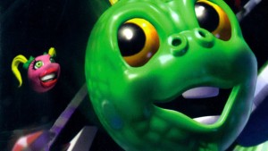
Return of the Dinosaurs / Issue #10
A blast from the past. Almost looks like the back of a kid's cereal box. And it very well could be considering how cute that T-rex looks. He's got a twinkle in his eye and a little smile to boot. Obviously his dislocated left arm isn't fazing him one bit. Way to tough it out big guy.
These were simpler times...

Super Adventure Island / Issue #4
Speaking of simpler times... Rad background dude! I swear I transport back to the 80's when I look at this cover. It just totally messes with any vibe the art had going for it. And speaking of said art (which is the cover art for the game, by the way), does anyone else find it completely ridiculous? Fighting a fire-breathing dragon with a wooden boomerang? How is that going to work? Heading into battle wearing only a straw skirt and a hat? What? What good is the hat? Riding in an obviously unstable mining cart that is about to go off the rails? It all makes sense. Does Master Higgins even notice he's about to plummet to his death if the dragon doesn't get him first? Tough spot.
Oh yeah, the yellow text is pretty hard to read as well - big design faux pas.

Treasures of the Deep / Issue #51
Nothing gets my gamer juices flowing like the though of swimming with some fish. And a shark. Did I mention those fish look like they're either scared ****less of said shark or they're made of cardboard? And what is up with that shark? Is he just hanging out or does he have it in for that treasure hunting fool? What treasure are we looking for, by the way? Cardboard fish, perhaps? Nevermind that while all of this is occurring, you've got Yoshi putting the moves on Aerith. That's just plain creepy.

BattleTech / Issue #17
Man, that machine sure has a lot of missiles. Those prove useful when engaging your enemy in battle...not when you're giving your supposed enemy a cool profile shot of your ridiculous paint job. Did this thing get carved out of the planet Jupiter? Or maybe a giant rock? At least our "Special Role-Play Feature" looks to have scored a direct hit. Bam!
The real quandary is why Super Metroid only garnered, what, a mere 5% of the cover? Samus gets the shaft, what a shame.

Tekken 3 / Issue #61
This actually isn't that bad of a cover from a design standpoint, although I am a little intimidated by the fact that Tekken 3 will supposedly kick my butt. Meh.
The real crime here is Yoshimitsu; the most annoying, baffling character in the Tekken franchise. Who hops around on their sword? What purpose does that serve? What an idiot. Heck, I would have taken Kuma the bear over this chump for the cover. Just anyone but Yoshimitsu!

Red Faction / Issue #92 • Twisted Metal Black / Issue #93
The "let's cram as much text as we possible can onto the cover!" era. We've got some great cover art here. You wouldn't know it with the Moby Dick-length copy splattered about. Who needs a table of contents when the cover reveals practically everything in the mag?
Thankfully these days have passed.

Tony Hawk's Pro Skater 4 / Issue #110
Apparently the lighting was just too bright for Tony's delicate eyes. That, or he just got punched in the groin. You pick.

Tomb Raider 2 / Issue #56
Hollywood Hogan, The Giant, and Lara Croft. What do all three have in common? They all sport a mean scowl. This can't be a coincidence, can it?
Man, this issue just looks pissed off...

NBA Shootout '97 / Issue #48
Holy crap this cover is scary. Kevin Garnett looks deranged. Maybe it's because he just realized he has a fake basketball grafted onto his right arm. He seriously looks like he wants to devour the ball. He's not even looking at the rim he's supposedly dunking the ball into. And check out that cool right hand trying to block the enraged Garnett. "Give me five!" Watch out little hand, #21 might eat you for dinner.
Fail.

Turok 2: Seeds of Evil / Issue #69
Apparently Turok forgot to shave his armpits this morning. He might want to consider his nether region as well. The ladies will appreciate it.

NBA Jam / Issue #15
Recognize the dude about to unleash some "boom shak-a-laka"? Rest easy, it's not Kevin Garnett. Nope, even better. It's GI's very own editor-in-chief Andy McNamara. Who knew? As you can plainly see, he's got mad hoop skills. He's what you call a street baller. It's a shame he couldn't make it in the NBA. With ups like that, you'd think the sky would be the limit for good ol' Andy Mac.
Note to designers: Grainy, washed-out backgrounds do not lend themselves to making an attractive magazine cover.

The Warriors / Issue #145
This one takes the cake. One reason and one reason alone makes this cover infamously bad. Figure it out and you'll immediately understand why. You'll also wonder how it ever saw the light of day in the first place.
Any of these strike you as especially bad? Or are you actually fond of a few of them? Share your thoughts below.
I’d like to ask you to support Game Informer’s continued coverage of games with a subscription. For less than two dollars per issue, we mail you a full year of 10 print magazines, each with cover stories and preview features filled with exclusive details about the most exciting upcoming games. We profile and interview game creators. We look back on the rich history of gaming, and we celebrate what’s next.
Here on the website, we offer much of our content for free, including game reviews, daily news, videos, event coverage, and more – all with minimal ads.
We do so with a small editorial team, alongside contributing paid writers from around the world – over 65 individuals from 9 countries around the world, just in the last couple of years.
It’s not possible without support.
In a time when game makers and games coverage have faced hard struggles and layoffs, the future of this 30+ year magazine and community is at risk. Our new standalone magazine subscription is the number one way you can keep us alive – and we believe you’ll get a pretty fantastic gaming magazine in your mailbox every few weeks for your trouble.
Thank you.