Please support Game Informer. Print magazine subscriptions are less than $2 per issue
Ubisoft Unveils New Swirl Logo
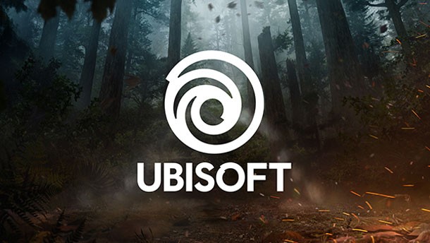
Ubisoft has a new logo. Say goodbye to the familiar swirl, and get ready to meet... a slightly different swirl.
"The new swirl is an evolution of our existing logo that marks a new era for Ubisoft, one with an increased focus on live and digital games as well as a player-centric approach to creating immersive worlds," the company wrote on a blog post.
The logo maintains a similar shape of the original swirl, which was introduced in 2013, but it's a bit chunkier.
"Our new logo is minimalist, modern, and monochromatic," the post continued. "It’s a window into our worlds, giving a preview of what’s to come by highlighting the artistry that goes into creating them. The swirl and the letter O are both deliberately created to be reminiscent of hand-drawn shapes and represent our human qualities of enthusiasm, curiosity and the grain de folie that Ubisoft is known for."
Ubisoft says the new logo will be adjusted to take on different colors and textures that will reflect whatever game it's associated with at the moment.
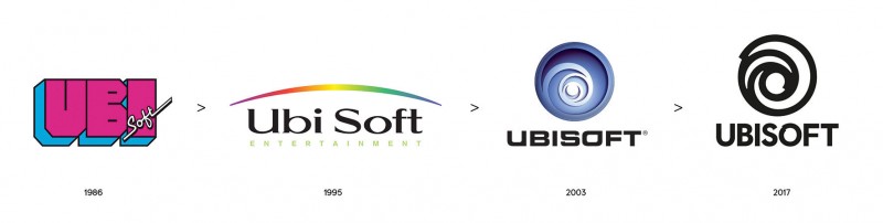
To put the change in perspective, the company also posted the visual timeline, below, which shows the evolution of its logo since it first started. Memories...
[Source: Ubisoft]
Our Take
I always liked Ubisoft's swirl, particularly when you got to zoom through it during a game's loading sequence. Oh well.
I’d like to ask you to support Game Informer’s continued coverage of games with a subscription. For less than two dollars per issue, we mail you a full year of 10 print magazines, each with cover stories and preview features filled with exclusive details about the most exciting upcoming games. We profile and interview game creators. We look back on the rich history of gaming, and we celebrate what’s next.
Here on the website, we offer much of our content for free, including game reviews, daily news, videos, event coverage, and more – all with minimal ads.
We do so with a small editorial team, alongside contributing paid writers from around the world – over 65 individuals from 9 countries around the world, just in the last couple of years.
It’s not possible without support.
In a time when game makers and games coverage have faced hard struggles and layoffs, the future of this 30+ year magazine and community is at risk. Our new standalone magazine subscription is the number one way you can keep us alive – and we believe you’ll get a pretty fantastic gaming magazine in your mailbox every few weeks for your trouble.
Thank you.