Please support Game Informer. Print magazine subscriptions are less than $2 per issue
Is This The New Xbox Logo?

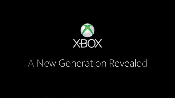
This morning on Xbox.com, there is a subtle change to the ubiquitous silver and green sphere logo. See for yourself below.

The shade of green used in the Xbox name has been made darker, and the shine has been removed from the X-embossed globe. The font hasn't changed.
The new logo matches the subtle changes to the design seen on the invitation for today's event. The new aesthetic also only appears on the front of the Xbox.com page, so it could simply have been updated for consistency with the invitation (also featured on the front page).

It also appears that Microsoft is parting ways with the original orange styling of the word "Live." Here's a comparison between the old and the new:

We'll know for sure later today at 10 AM Pacific / 1 PM Eastern.
Visit our Xbox Reveal Headquarters for complete coverage of today's news.


