Please support Game Informer. Print magazine subscriptions are less than $2 per issue
Designing The Xbox One
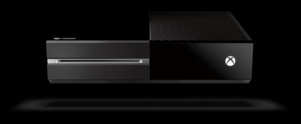
Microsoft put its new box on stage during its reveal event. Here’s the story behind that half-shiny black rectangle.
The new Xbox is already creating a bit of a stir, just based on its boxy exterior. Some see a futuristic device that will be at home next to any number of other consumer electronics. Others have compared it unfavorably to a decades-old cable box. Regardless of where you fit, Microsoft didn’t create the Xbox One’s shell impulsively. It’s the result of years of work and refinement. Here’s how Microsoft reached the finished product. (Click here for a look behind the controller's redesign.)
“We chose this direction because it felt understated, it felt more premium, and it felt more like entertainment,” says Carl Ledbetter, Microsoft’s senior principal creative director. “This isn’t just a gaming console. It’s really bringing a whole lot more in addition to games to people. We wanted it to feel like more about the entertainment system that people have at home and fit in with what people have.”
The system is about the same size as the original Xbox, though its 90-degree corners make it seem less monstrous. The console’s powerful innards require plenty of venting – the company clearly hasn’t forgotten about the Xbox 360’s so-called “red ring of death” – and fully half of the system’s top is designed to accommodate airflow.
The case’s proportion should be familiar, too. “This proportion is based on the cinematic aspect ratio of 16:9 and how that could be split in a 50/50 way,” Ledbetter says. The top is visually divided into two. “Half of that is a glossy finish, and half of that is a matte texture. We did exhaustive work on the vent design to create something that was more about a texture and something that felt like it could come from the world of the digital world of the UI and also allow the console to breathe really quietly.”
The box is a rich, shiny black (it’s a color that Microsoft is calling “liquid black”), and Ledbetter cracks a double This is Spinal Tap joke about the team turning black up to 11. The system lights aren’t pale green, but are instead a glowing white. “We switched to white for a couple reasons,” Ledbetter explains. “Number one is this is more than about just gaming, so we wanted to symbolize that it does more. Secondly, we wanted it to be different from 360. [The Xbox 360] has a signature green element, and this is different from that.”
Kinect 2.0’s design follows the same design cues as the main box. “In the last Kinect sensor, it had all of those camera windows in the front,” Ledbetter says. “This one is now all about feeling more clean, and we created this glasslike front lens on the front that essentially hides all the cameras behind it. What it does is it allows all this stuff to come through, but it’s not blasting you with all these details and components and technology stuff.”
Visit our Xbox Reveal Headquarters for complete coverage of today's news.
I’d like to ask you to support Game Informer’s continued coverage of games with a subscription. For less than two dollars per issue, we mail you a full year of 10 print magazines, each with cover stories and preview features filled with exclusive details about the most exciting upcoming games. We profile and interview game creators. We look back on the rich history of gaming, and we celebrate what’s next.
Here on the website, we offer much of our content for free, including game reviews, daily news, videos, event coverage, and more – all with minimal ads.
We do so with a small editorial team, alongside contributing paid writers from around the world – over 65 individuals from 9 countries around the world, just in the last couple of years.
It’s not possible without support.
In a time when game makers and games coverage have faced hard struggles and layoffs, the future of this 30+ year magazine and community is at risk. Our new standalone magazine subscription is the number one way you can keep us alive – and we believe you’ll get a pretty fantastic gaming magazine in your mailbox every few weeks for your trouble.
Thank you.