Please support Game Informer. Print magazine subscriptions are less than $2 per issue
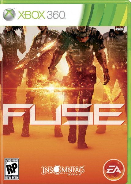
This Is Fuse's Box Art

Insomniac Games released the final North American box art for Fuse. Hope you like the color orange. The co-op shooter still doesn't have an exact release date just yet. EA says it's schedule to ship this coming spring for PlayStation 3 and Xbox 360. Underneath you'll find the original cover for the game when it was called Overstrike.
What do you think of the cover? Sound off in the comments below.

I’d like to ask you to support Game Informer’s continued coverage of games with a subscription. For less than two dollars per issue, we mail you a full year of 10 print magazines, each with cover stories and preview features filled with exclusive details about the most exciting upcoming games. We profile and interview game creators. We look back on the rich history of gaming, and we celebrate what’s next.
Here on the website, we offer much of our content for free, including game reviews, daily news, videos, event coverage, and more – all with minimal ads.
We do so with a small editorial team, alongside contributing paid writers from around the world – over 65 individuals from 9 countries around the world, just in the last couple of years.
It’s not possible without support.
In a time when game makers and games coverage have faced hard struggles and layoffs, the future of this 30+ year magazine and community is at risk. Our new standalone magazine subscription is the number one way you can keep us alive – and we believe you’ll get a pretty fantastic gaming magazine in your mailbox every few weeks for your trouble.
Thank you.