007 First Light headlines our newest issue about the most anticipated games of 2026 and beyond. Subscribe now!
This Is What Wii U Game Boxes Look Like

Update: Nintendo has confirmed that these are in fact the legitimate box arts for Wii U titles. Below is the company's statement sent to Game Informer.
Nintendo has finalized the design of the Wii U game box art, and many of our publishing partners have already incorporated it into their own game packaging. We are seeing those game packages online as retailers are starting to showcase their games. For details about a specific game’s artwork, please contact the game’s publisher. Nintendo-published game boxes will appear shortly with placeholder logos, and then ultimately with the final artwork for each game.
-------------------------------
Amazon product listings for Assassin's Creed 3 and Marvel Avengers: Battle for Earth may give us our first look at Wii U's packaging design.
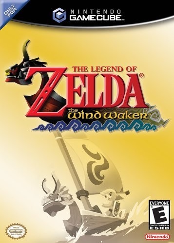
The top of the box is designed similarly to Nintendo's GameCube games (see below). The color combo of blue and yellow isn't as bad as Microsoft's neon green boxes, but it certainly looks out of place on that Assassin's Creed box.
I've reached out to Nintendo to see if these boxes are the real deal.

Popular Content


Get the Game Informer Print Edition!
Explore your favorite games in premium print format, delivered to your door.
- 10 issues per year
- Only $4.80 per issue
- Full digital magazine archive access
- Since 1991