Please support Game Informer. Print magazine subscriptions are less than $2 per issue
Arkham City Box Art Gone Wrong

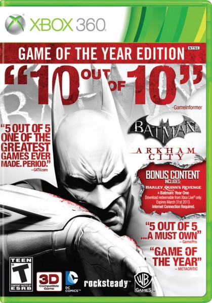
Warner Bros. today announced the Game of the Year edition for Batman Arkham City. Too bad the game's box art is an awful mess.
I'm going to let the picture below do most of the talking, but there's a few things worth pointing out. At a glance you'd think the name of this game is "10 out of 10," but that's our review score. Also, the title is actually one of the smallest things on the cover (it's on the right-hand side).
Even better, it uses a review quote from GamePro, but that magazine no longer exists!
I’d like to ask you to support Game Informer’s continued coverage of games with a subscription. For less than two dollars per issue, we mail you a full year of 10 print magazines, each with cover stories and preview features filled with exclusive details about the most exciting upcoming games. We profile and interview game creators. We look back on the rich history of gaming, and we celebrate what’s next.
Here on the website, we offer much of our content for free, including game reviews, daily news, videos, event coverage, and more – all with minimal ads.
We do so with a small editorial team, alongside contributing paid writers from around the world – over 65 individuals from 9 countries around the world, just in the last couple of years.
It’s not possible without support.
In a time when game makers and games coverage have faced hard struggles and layoffs, the future of this 30+ year magazine and community is at risk. Our new standalone magazine subscription is the number one way you can keep us alive – and we believe you’ll get a pretty fantastic gaming magazine in your mailbox every few weeks for your trouble.
Thank you.