Switch Lights

The lights are on

The Mass Effect Covers That Could Have Been

During our recent trip to BioWare's Edmonton studio to check out Mass Effect 3, we got to see a lot of cool stuff related to the franchise...including these mock-ups of box art possibilities for the original Mass Effect.

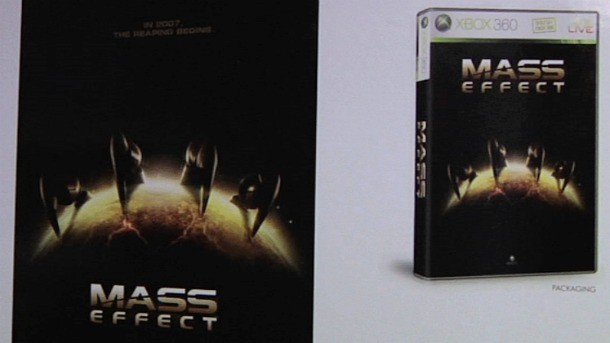
During the filming for our Mass Effect 3 video features, we were allowed to capture some footage of these preliminary tests for the game's cover (which are hanging up in a hallway of the office). It's interesting to see how some of these covers highlight different characters and aspects of the game. My personal favorite is the one above, accompanied by the tagline "In 2007, The Reaping Begins." Of course, that gives away something about the story, so I can see why BioWare steered away from it.

Check out all six in the gallery below.

Email the author , or follow on , , and .

Comments
  • I like these much better than the ones for 1 and 2.
  • I like the middle one in the top row. And I didn't like the cover for ME2 at all. It looked too.....cheesy?
  • i'm sure one of them was used for the European cover art since theirs are always better than the US art
  • WHO IS THE IDIOT THAT DIDN'T USE THESE!!!!!! my guess is some hobo Microsoft
  • Some of those covers are so much cooler than the two they eventually went for, even if the sixth one reminds me of Alpha Protocol (although I admit that came out 3 years later), and the fifth one looks like KotOR.

    Interesting to see the different looks Shepard had to start with too.

  • Im confused. These covers are way better than the actual ones. I have to question biowares judgement here.
  • These look 100x better than the covers for ME1 and ME2

  • I really like all these covers, especially the first one. Is there an artbook that came with the first game that contains all these cause if so I want it.

  • Yeah I personally think that all of these look better than the one they choose for the first game. And is it just me or, wouldn't the one GI liked still worked if they just removed the tagline? Just keep the reaper claw around the earth and release it as is? I would so have that as a PC wallpaper. That's just wicked!

  • I can kind of see why Bioware didnt pick these. They give too much away, and are a bit generic, but the bottom middle one is pretty epic.

  • I liked the cover for Mass Effect 2 collector's edition much better than the ordinary so I bought that instead
  • GI get Bioware to look at this and maybe it will persuade them to make the cover like these!

  • I always hated the Mass Effect cover. Those are so much better!

  • The Reaping begins? Talk about lame taglines.

    Other than that, I agree with the sentiments that all of these other covers were better.

  • I really like the third and sixth one myself, but the all look pretty cool. I hope there's some kind of special edition of ME3, with an art book included.

  • All of these covers have one thing in common, they're all better than the cover Bioware ended up going with. lol

  • I like the first 1... :D

  • Wow, it's hard to pick a favorite, they are all amazing. I can see why the reaping begins didn't make the cut, but how did none of the others not make it? It would be cool if Bioware made this art available for purchase

  • Where were these? Shepard looks kind of creepy on the actual cover. D:

  • The one with the blue line dividing the characters and Earth is amazing!!

    Please do something similar for ME3!

1 2 3 4 5 Next ... Last