Please support Game Informer. Print magazine subscriptions are less than $2 per issue
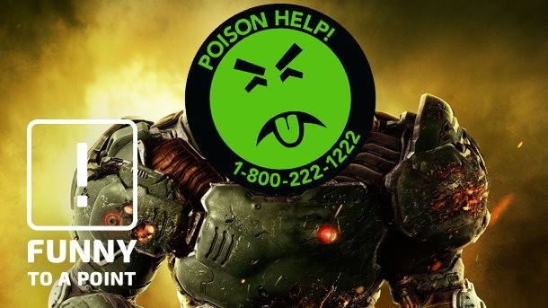
Funny To A Point – Modern Box Art Sucks: An Investigation
Nowadays, most video game box art only delivers on half of its promise – it does indeed appear on a box containing a video game, but the nearly photo-realistic images of stoic characters holding guns hardly qualify as art. However, boring box art is only half the story; you can't appreciate our modern plight without first knowing how ass-kickingly awesome the box art of yesteryore was. So grab your pith helmet; you're about to embark on a decades-spanning adventure that will quantitatively demonstrate just how bad modern box art sucks.
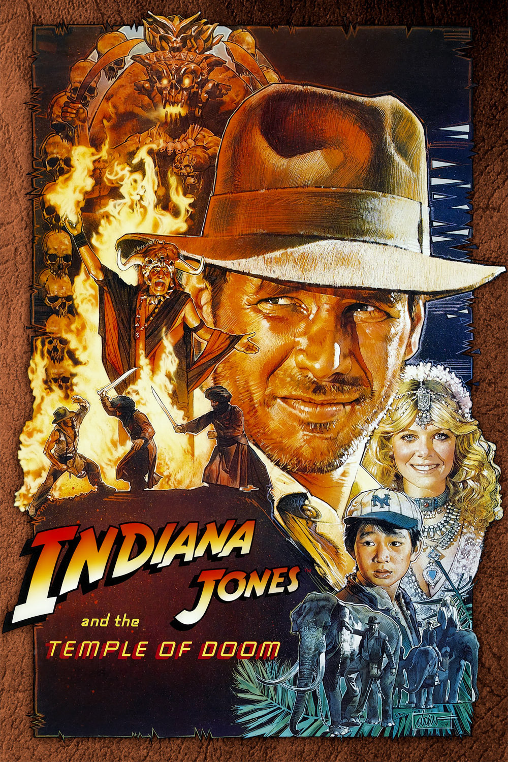
If there's anything we can learn from old movie posters (besides the fact that all aliens, robots, and monsters are perverts), it's that great art can really sell you on a fantasy. Even a guy like Indiana Jones looks that much cooler* on a hand-painted poster – and don't even get me started on Hildebrandt's orgasmic vision of Star Wars.
Classic video game box art followed a similar tack, and was just as fantastical. In a very real sense it had to be – you can't just put a bunch of blocky crap on a cover and expect people to buy it (though to its credit, Nintendo tried its best). Some classic box art was so epic that you couldn't even feel ripped off when you saw the real game in action.
To investigate how far video game box art has fallen over the years, I have prepared a series of side-by-side comparisons. On the left, you'll find the box art of a high-profile game released in 2016. On the right, the box art for a comparable game from a bygone era. Which is better? You be the judge.**
Note: You can click on the images for a larger version.
Exhibit A: Doom vs. Doom
We open with a well-recited example from this year, but that
doesn't make it any less true. 2016's stellar Doom reboot launched with a
whitewashed version of the classic logo stamped over the most generic space
marine you could possibly imagine. Compare that to the glorious box art of the
original Doom, which is basically gaming's equivalent of the famous
Ali/Liston photo, if Ali had been standing on a pile of demon corpses. The logo, marine, and framing are all way more boring in the reboot – just look
at those two images and ask yourself which game you would rather play. Done?
Moving on...
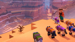
Exhibit B: Uncharted 4 vs. Spelunker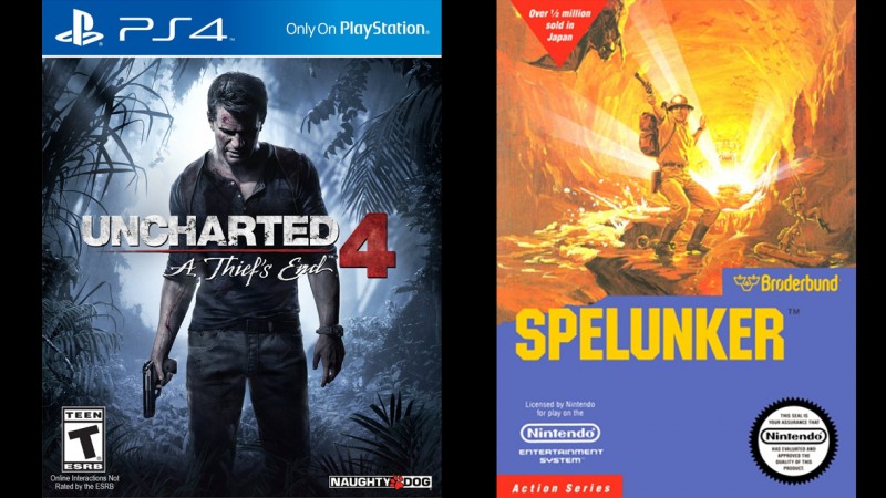
Here's an easy litmus test that you're going to see a lot in
the examples that follow (as well as the previous one). Does your character
look like he's patiently waiting in line for his turn at the firing range? If
so, congratulations: You've made bad box art – time to start over. I don't
blame Naughty Dog for putting Drake on the cover; he's the star of the show and
a wonderfully multifaceted character. But he also does a lot of things that are
more interesting than pensively staring at his shoes. The Spelunker guy is also
an adventurous treasure hunter with a gun – but he's shooting it at a giant bat in the middle of a lava
river(?), while an inset picture shows him rappelling into a raft, for some
reason. Now that's an adventure!
Exhibit C: Battlefield 1 vs. Sky Shark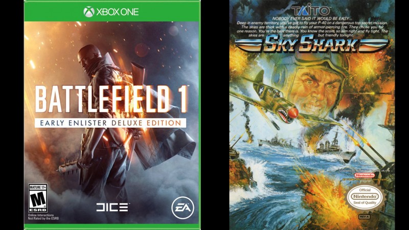
Next up in line is the Battlefield 1 guy. The Battlefield
series has a long history of putting a monochromatic shot of a soldier on the cover and
then throwing in a little orange for a splash of excitement. You know what's
actually exciting? Planes shooting bullets and torpedoes at ships that are
shooting back with bombs exploding everywhere and a close-up of a soldier's crazed,
terror-gripped face as he flies toward his certain doom. Battlefield 1's trailers
have certainly captured those thrills, so why are they still punting on the
box?
Exhibit D: Call of Duty: Infinite Warfare vs. Mechanized Attack
The rivalry between Call of Duty and Battlefield is real,
though in this case it's a race to a cozy afternoon nap. COD ups the boring
factor with a faceless soldier and no color whatsoever. Now take a look at
Mechanized Attack's box art. Not only is it way more exhilarating, it would
also be more accurate for Call of Duty – it shows the character from a
first-person perspective, and I'm pretty sure you've shot all of those things at
one point or another in the series. Call of Duty has been gonzo for years
now, and it wouldn't hurt for the box to reflect that with some kick-ass, stylized art.
Exhibit E: Titanfall 2 vs. NAM-1975
What's better than a faceless guy holding a gun in box art?
A faceless guy and his mech holding guns! NAM-1975 might not be a perfect
analogue – it seems like there's some kind of time-traveling going on there –
but the box art demonstrates that the game has real characters, plenty of
action, and a story of some kind (clearly somebody got kidnapped!), in addition to the giant robot with a gun.
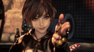
Exhibit F: Quantum Break vs. Time Lord
Oh hey, Shawn Ashmore is waiting in line too. For a game about a guy
with the power to alter the very fabric of time, the box art couldn't be more boring.
Time Lord may be a bit of an unfair comparison, since it looks like that dude's
adventure is fundamentally more entertaining, but a stylistic mash-up of
concepts and characters would've served Microsoft's exclusive a lot better than
a rejected Battlefield cover (seriously guys, the color orange isn't that exciting).
Exhibit G: Watch Dogs 2 vs. Syndicate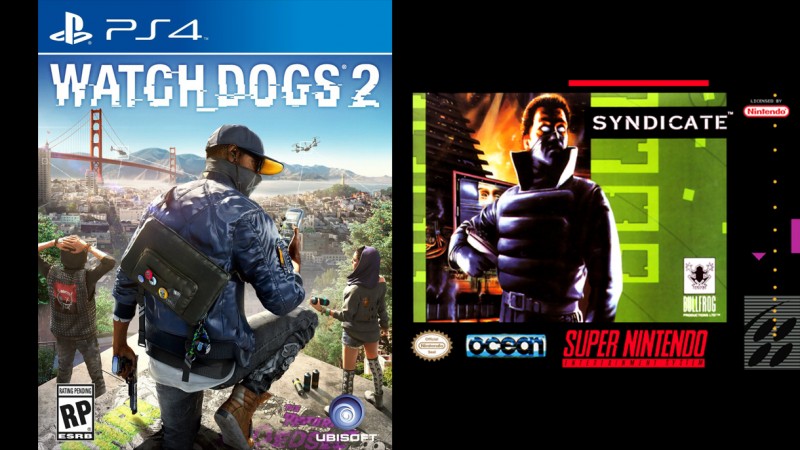
If you thought front-facing portraits were exhilarating,
wait 'til you see what happens when characters turn around! Syndicate was the closest
equivalent I could think of for an open-world hacking game, and even though it
also features a character just standing there, it does a way better job of
conveying a tone – an eerie, sci-fi dystopia full of cyborg assassins and
futuristic buildings that may or may not be on fire all the time. That's a heck
of a lot cooler than a disaffected millennial checking his Tweets.
Exhibit H: The Division vs. Action In New York
More backs, more guns, more bored protagonists. I'll be
honest: I have no idea what Action In New York is about and mainly just picked
it because both games are set in the same city. However, Infogrames' colored
armadillo logo is more interesting than anything going on in the Division's box art.
Hell, so is the promo shot for Lifetime's
TV show for that matter.
Exhibit I: Homefront: The Revolution vs. Guerrilla War
Rejoice! We've finally reached the front of the line!
Homefront's random, masked freedom fighter is slightly more evocative of the
themes of the game, but it still pales in comparison to the action and emotion
of SNK's Guerrilla War cover. You can practically hear the thunderous explosion
of the collapsing train, the stray bullets splashing in the water, and the
bearded super guerrilla yelling, "Leave no man behind!" Chuck Norris ain't got
sh-- on this cover...though he probably had some hand in inspiring it.
Exhibit J: NHL 17 vs. Blades Of Steel
Let's move away from shooters and into the realm of sports
for a bit. Virtually all modern sports games feature popular athletes on their
covers. Chasing after the massive fan bases of your sport's super stars makes
sense, but you can do so much more than just slap a big EA Sports sticker over
the picture of a celebrating player. Even if you do recognize Vladimir
Tarasenko without the aid of Google, NHL
17's cover doesn't convey the timeless thrills, rivalries, and (embarrassingly outdated) fist fights of
hockey like the classic Blades of Steel cover. Plus, Blades of Steel is a
totally cooler name.
Exhibit K: NBA 2K17 vs. Bill Laimbeer's Combat Basketball
Kobe Bryant's NBA 2K17 montage cover is a bit more inspired,
but it doesn't hold a flame to Bill Laimbeer's Combat Basketball. I know what
you're probably saying: "But Jeff, that's not fair, NBA 2K17 doesn't have
half-cyborg monster athletes fighting each other!" To which I say, "Why the
hell not?"
Exhibit L: The Show 16 vs. Base Wars
See the above argument.
Exhibit M: Skyrim Special Edition vs. Crystalis
The Elder Scrolls series has always gotten screwed in the
box-art department. The open-world RPG series is full of magic and monsters –
not to mention bear
rollers and cheese-obsessed
weirdos. Yet despite all the fun and insanity of The Elder Scrolls world,
the boxes always get stuck with little more than a logo. Bethesda should take a
hint from Crystalis and put Dovakiin smack dab in the middle of a Freaks
Anonymous meeting.
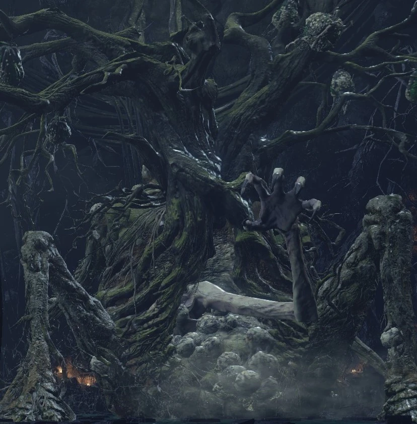
Exhibit N: Dark Souls III vs. Battle Chess
Another RPG series, Dark Souls III's box art easily trumps
all the other 2016 entries we've had on this list so far. The tortured figure
crumbling into dust faithfully conveys the despair that awaits you in From
Software's latest torment factory. The only problem? While it's haunting, it's
not exactly exciting; you hack and slash your way through countless unholy
horrors in Dark Souls III, and you don't wither away when you die – you get pounded
into the ground by a giant
tree monster's hemorrhoids. Gameplay-wise Battle Chess is a positively
lousy comparison, but the box art also succeeds in making chess look more
thrilling than Dark Souls, so it's a good place to start.
Exhibit OMG: XCOM 2 vs. Alien Syndrome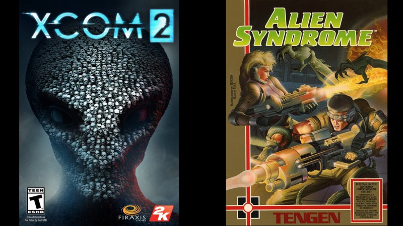
XCOM 2's box art is also pretty good – it's an alien's head,
made up of a bunch of human skulls. It successfully captures the conflict between
man and alien, and hints at the grim odds that the human survivors face. But
let's face it: XCOM is all about watching in horror as your beloved space
marines get torn to pieces by grotesque alien monsters. Alien Syndrome's box
art conveys the same dire conflict, while also highlighting the emotions of its
characters – the main emotion being "I just pooped my space pants because this
thing is about to eat me." It's not as subtle as XCOM 2's box art, but it's
awesome nonetheless.
So, looking at the above examples as a whole, what's the main difference between modern and classic box art? If your answer is that the old ones are batsh-- crazy, you're only half right. The classic art is a lot wilder, but the games themselves aren't; aside from the dearth of robot athletes, modern games contain all the chaos and drama of older titles, if not more. The wild antics simply aren't on the box anymore because they lack the other common trait all these classic examples share: vision.
Yes, old box art was still trying to sell a game, but it was made by artists brimming with creativity and passion for their project. All of the classic examples spark your imagination and answer the same question as soon as you pick up the box: "What is the fantasy?" Whether it's exploring strange and dangerous worlds, making a last stand in an unwinnable war, or shouting down the shiny robot that just torched your city, the art is built on emotion. It doesn't just show you what you'll do in the game, but what you'll feel while you're doing it. The modern-day box art, on the other hand, reeks of focus groups and accountants. The only question it answers is, "What games have sold well in the past, and how can we copy them?"
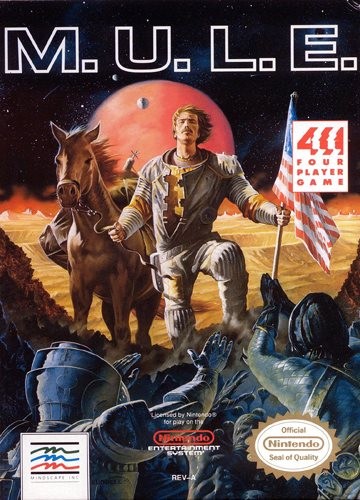
That difference is why in the '80s you could even make a game about a space mule look awesome, and why nowadays publishers are content to just slap a jackass on the cover and call it a day.
*Wait, that's not the
right poster.
**Just kidding, the old box art is ALWAYS better.
Need a few more laughs? Click on the banner below to head to Funny To A Point's fancy-pants hub!

I’d like to ask you to support Game Informer’s continued coverage of games with a subscription. For less than two dollars per issue, we mail you a full year of 10 print magazines, each with cover stories and preview features filled with exclusive details about the most exciting upcoming games. We profile and interview game creators. We look back on the rich history of gaming, and we celebrate what’s next.
Here on the website, we offer much of our content for free, including game reviews, daily news, videos, event coverage, and more – all with minimal ads.
We do so with a small editorial team, alongside contributing paid writers from around the world – over 65 individuals from 9 countries around the world, just in the last couple of years.
It’s not possible without support.
In a time when game makers and games coverage have faced hard struggles and layoffs, the future of this 30+ year magazine and community is at risk. Our new standalone magazine subscription is the number one way you can keep us alive – and we believe you’ll get a pretty fantastic gaming magazine in your mailbox every few weeks for your trouble.
Thank you.


