Please support Game Informer. Print magazine subscriptions are less than $2 per issue
Games From Last Generation With Distinct Art Styles
This last generation was many gamers’ first step into the world of HD graphics. It was an incredible leap; games were more detailed and shined visually. But along with the good, there was some bad. Super-detailed and visually impressive does not always equate to appealing to the eye. While we saw our share of grays and browns this generation, certain games kept the sights interesting with distinct and cool art styles.
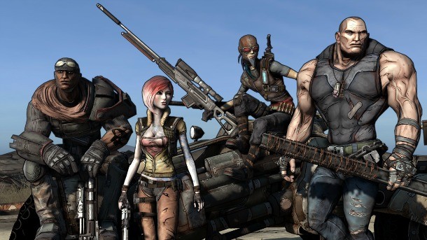
Borderlands (360, PS3, PC, and Mac)
Borderlands looks like a comic book come to life, but it wasn’t always this way. Gearbox originally intended for Borderlands to launch with a more realistic art style, similar to other shooters at the time. Thankfully, Gearbox decided to change its tune as it closed in on the game’s completion, opting for an art style that set it apart from other shooters. Imagining the world of Borderlands without its current style is hard, especially since it’s used to reflect the absurd universe.

No More Heroes (Wii)
This last generation saw Sony and Microsoft venturing into the world of HD visuals with their consoles, but Nintendo’s Wii didn’t boast the same capability. Despite this, a few Wii games made up for the graphical gap with stunning art design. No More Heroes is a great example. Suda51 is well known for his hyper stylized games, but No More Heroes’ cel-shaded visuals, complete with heavy use of shadows, really stood out.

Limbo (360, PS3, PC, Mac, iOS, Linux, OnLive, and Vita)
Indie games started to rise in popularity during the last generation – proving that you don’t need HD visuals to make an interesting game – but few games managed to do what Limbo did with its art. The entirety of Limbo is presented in black, white, and all the shades in between; everything looks more like a shadow than anything else. Light also plays a central role by adding textured distortion or being blinding at times.

The Unfinished Swan (PS3)
The Unfinished Swan starts in a unique way: a completely white screen devoid of anything. But when you start throwing paint and splashing it over the hidden environment, the world starts revealing itself. Seeing your surroundings brought to life with the rough splashes of paint is a cool moment from last generation that few will forget.

AntiChamber (PC, Mac, and Linux)
The assets making up AntiChamber occasionally look like bad art made in Microsoft Paint. They’re about as minimal as it gets for a first-person perspective game, but when thrown together they make craft a mind-bending, complex puzzle game. This is likely the best example of environment being worked into a game to form puzzles. It’s basically the video game equivalent to an optical illusion book.
Up Next: colorful piñatas, the lack of color, and anime.

Viva Piñata (360 and PC)
Viva Piñata closely looks like colorful, sugar breakfast cereal come to life. It’s hard to talk about the transition of HD visuals and the benefits it has without talking about the colorful world of Viva Piñata. Viva Piñata’s color is a pleasant contrast to a console generation filled with the dark and gritty. Actually, the purpose of Viva Piñata is to take something desolate and untended and turn it into a vibrant plot of land.

Valkyria Chronicles (PS3)
While not as vibrant as some of the other games listed, Valkyria Chronicles still has a stunning visual style. It’s cel shaded, though it appears duller and toned down, but in the best of ways. The whole game looks like a cross between a hand drawn anime and a water color painting. Its distinctive style is definitely a good way to differentiate this game from other strategy games.

Madworld (Wii)
Violence and gore are not usually mentioned along with the Nintendo Wii. But Madworld is a massive exception to that. It takes place in a fictional city that has been locked down and pitched against each other in a game show based on killing everyone you come across. The majority of Madworld’s graphics are in black and white, but with the blood showing up in a harsh crimson. The experience is very similar to something like an interactive version of the gritty noir graphic novel and film franchise, Sin City.

Ni no Kuni: Wrath of the White Witch (PS3)
Studio Ghibli has one of the most identifiable art styles in all of anime. The studio brought that style over to video games this generation, when they co-developed Ni no Kuni. Not only does the game look straight out of a Studio Ghibli film, but it also has creatures and environments designed in the same odd and creative way you’d expect While elements of the story and gameplay received mixed criticism, the art and world of Ni no Kuni was universally praised.

Far Cry 3: Blood Dragon (360, PS3, and PC)
The screen explodes with 80’s charm in Far Cry 3: Blood Dragon. This standalone title, based on the Far Cry 3 engine, is every cliché and trope from the action movies of the 1980’s thrown into a video game. Instead of hyper-realistic cinematics to tell the story, Blood Dragon uses 8-bit style cutscenes reminiscent of old NES games. The world is dark, but heavily splashed with neon and explosions that pop in contrast.

Mirror’s Edge (360, PS3, PC, iOS, Windows Phone)
Mirror’s Edge went for a realistic art style, but with a twist: it’s minimal on color. Much of the city is presented in white, and interiors are very dark – but color is added to give you direction. Red objects lead toward your objective, and the others provide a decorative contrast. There’s also no HUD; the only thing on screen besides your environment is a reticle. Simply put, Mirror’s Edge is unmistakable in a generation filled with realistic-looking games.
Did we miss any games you felt had a great and distinct art style? We'd love to hear your opinion! Let us know in the comments below.
I’d like to ask you to support Game Informer’s continued coverage of games with a subscription. For less than two dollars per issue, we mail you a full year of 10 print magazines, each with cover stories and preview features filled with exclusive details about the most exciting upcoming games. We profile and interview game creators. We look back on the rich history of gaming, and we celebrate what’s next.
Here on the website, we offer much of our content for free, including game reviews, daily news, videos, event coverage, and more – all with minimal ads.
We do so with a small editorial team, alongside contributing paid writers from around the world – over 65 individuals from 9 countries around the world, just in the last couple of years.
It’s not possible without support.
In a time when game makers and games coverage have faced hard struggles and layoffs, the future of this 30+ year magazine and community is at risk. Our new standalone magazine subscription is the number one way you can keep us alive – and we believe you’ll get a pretty fantastic gaming magazine in your mailbox every few weeks for your trouble.
Thank you.