007 First Light headlines our newest issue about the most anticipated games of 2026 and beyond. Subscribe now!
Best And Worst Box Art Of 2013
You can't judge a game by its cover, but that shouldn't stop you from judging the cover itself. Box art should represent the characters, themes, and action of a game – and look cool to boot. Gamers see amazing and awful cover art on games spanning the entire spectrum of quality, and these are our picks for the best and worst examples of 2013.
Best: BioShock Infinite (Alternate)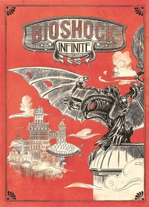
Done in an old-timey illustration style and featuring the awesome-looking Songbird, this cover communicates the era, setting, and one of the major figures in the game. Plus, it just looks rad.
Best: Dragon's Crown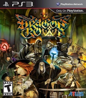
This cover just looks fantastic. Vanillaware games have breathtaking art, and despite some controversy surrounding the character designs, this cover does a great job highlighting the distinct visual style of Dragon's Crown.
Best: Far Cry 3: Blood Dragon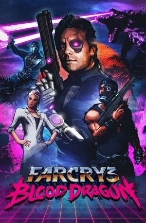
This is just perfect. Blood Dragon pays homage to action movies of the '80s with cybernetics, lots of neon, and cheesy one-liners. This art would have looked right at home in a movie theater (or on a Genesis box), and captures the spirit exactly.
Best: The Last of Us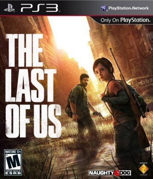
The world of The Last of Us is desolate and hopeless, which comes across clearly in this image. The cover also features Ellie prominently even though players control Joel – an important fact since she is arguably the more significant character.
Best: Tearaway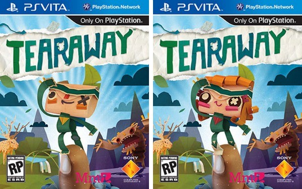
Not only does this cover convey the cute papercraft aesthetic of Tearaway, but it's also reversible to give both of the playable characters – Iota and Atoi – an equal chance in the spotlight.
On the next page: The worst covers of 2013.
Worst: BioShock Infinite (Standard)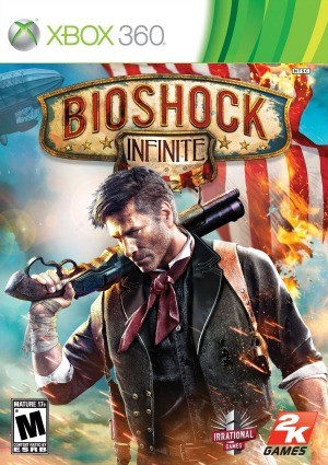
Unlike the alternate version of the game's cover, this one tells you practically nothing. Forget Elizabeth and Columbia...apparently BioShock Infinite is about Booker DeWitt, the modern avenging hipster.
Worst: NBA Live 14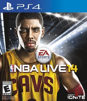
Kyrie Irving does not seem happy to be on the cover of this game. We can't blame him; it's awful. His resigned gaze seems to say to players: "Yeah, we both made a mistake here. But at least I'm getting paid."
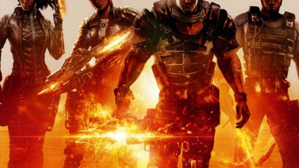
Worst: Fuse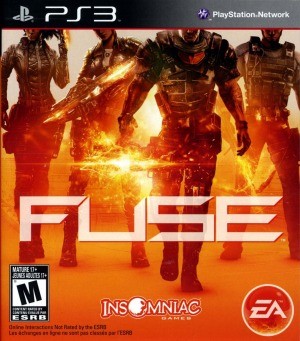
Okay, this just looks like an honest mistake. Someone in the art department just got the box dimensions wrong, which resulted in the top half of everyone's head getting cropped out. Right? This couldn't have been intentional.
Worst: WWE 2K14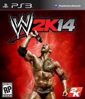
Gross.
Worst: Dark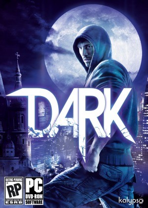
Dark is about vampires. Going by this cover, you'd think it was about some regular dude who wandered off the set of the shoot for the latest Marshall's ad, then got lost and scared once the sun went down.
Did we miss anything? Nominate your favorite and least favorite cover images from 2013 in the comments below.
Popular Content


Get the Game Informer Print Edition!
Explore your favorite games in premium print format, delivered to your door.
- 10 issues per year
- Only $4.80 per issue
- Full digital magazine archive access
- Since 1991