Please support Game Informer. Print magazine subscriptions are less than $2 per issue
Windows 8 Better Than Expected, Still Has Monumental Stupidities
The new operating system from Microsoft hasn’t caused my computer to explode, burned my house down, or deleted my save files. In that regard, the reports of the coming PC gaming apocalypse may have been slightly overstated. Heck, Windows 8 even has some nifty new tricks and shortcuts that I am quickly falling in love with. Nonetheless, the new Start screen and the Modern UI are unmitigated disasters that would have me uninstalling in a rage if I hadn’t found workarounds that let me ignore them entirely.
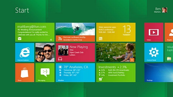
The replacement of the venerable Start menu with the fancy-pants, tablet-style Start screen is annoying, in that I don’t want my base-level shortcut for finding programs and tasks to take over my entire 22” widescreen monitor(s). I can deal with it, though, particularly because of the amazingly useful feature that displays real-time program, task, and settings results as you type with no other key press or mouse click required. I still vastly prefer the trusty old Start menu for about a hundred reasons, but the Start screen itself isn’t the worst thing in the world. No, that honor belongs to the Modern UI.
I’m old enough to remember when Apple first introduced the Multi-Finder in System Software (as we used to call MacOS) 5. With this powerful new tool, I could run multiple applications at the same time. A single click flipped between between the state report I was nominally writing on New Jersey and the MacPaint file in which I was (poorly) doodling a map for the fantasy world in my head. The dawn of a brave new world of procrastination and (much later) productivity was upon us in 1987.
Nowadays, I multitask for more mundane tasks like editing and uploading pictures to our website, copy/pasting text between editing and browser windows, and keeping an eye on email and Twitter on a second monitor while I write vitriolic editorials. I cannot imagine going back to a one-app-at-a-time interface.
And yet, that is exactly what the Modern UI does in Windows 8. To swap between your browser and email programs, you can either press the Start button (taking you back to the Start screen) and then click on the second program, or mouse over to the upper-left corner of the screen and pick the program from the list of Modern apps that appears. Whatever you do, the currently active app takes up the whole screen.
This doesn’t sound so bad when you compare it to tablet interfaces. Hell, it’s actually a really good tablet interface. The thing is, though, if you’re using your desktop or laptop like you would use an iPad, you’re doing it wrong. Clicking into a different window takes effectively zero time, where either Modern UI method takes a second or two. Not a big deal, right? Wrong, when you’re adding that much more annoyance to the actions you take thousands of times a day like I do.

On an intellectual level, I understand why Microsoft has chosen this direction. The company wants to make Windows more inviting to casual users who just want to click on the gigantic Facebook button in the middle of their screen so they can laugh at kittens and troll relatives with stupid political beliefs (because obviously a pinned Internet Explorer icon on their taskbar is just too confusing). I’m sure Microsoft also badly wants to tie Windows 8 as tightly as possible across PC, phone, and tablets to make users more comfortable and developers more likely to create apps and content for its fledgling mobile OS, which is struggling to gain any market share against the enormous entrenched iOS and Android ecosystems.
The problem is that the company has done so by ignoring the vast oceans of Windows users who use Windows because they need (for work) or want (for better kitten-captioning and uploading) the OS’s immense power and flexibility for more complex tasks.
The real brain-melting idiocy of the whole situation is that Windows 8 is just as good – arguably better than ever – at handling the demands of users like me once you get past the stupid Start screen (doable by default with a registry hack, or my preferred method of a five-dollar third-party app that also brings back the Start menu). The desktop and taskbar work wonderfully, and I love some of the new shortcuts like the Charms bar. Even the Start screen itself has legitimately useful functionality when you want to do one of the things it does well, like search through programs and tasks or monitor multiple update streams through its widget-like live tiles. Forcing it on users as a first-touch landing point for the entire OS, though, smacks you in the jaw with its limitations so hard that it’s difficult to appreciate its strengths.
But hey, we get achievements in Minesweeper now! That makes up for it all, right?
I am terrified to know how many people for whom that is true.
I’d like to ask you to support Game Informer’s continued coverage of games with a subscription. For less than two dollars per issue, we mail you a full year of 10 print magazines, each with cover stories and preview features filled with exclusive details about the most exciting upcoming games. We profile and interview game creators. We look back on the rich history of gaming, and we celebrate what’s next.
Here on the website, we offer much of our content for free, including game reviews, daily news, videos, event coverage, and more – all with minimal ads.
We do so with a small editorial team, alongside contributing paid writers from around the world – over 65 individuals from 9 countries around the world, just in the last couple of years.
It’s not possible without support.
In a time when game makers and games coverage have faced hard struggles and layoffs, the future of this 30+ year magazine and community is at risk. Our new standalone magazine subscription is the number one way you can keep us alive – and we believe you’ll get a pretty fantastic gaming magazine in your mailbox every few weeks for your trouble.
Thank you.